Posted on

Live Show Recap: Abstract and Geometric

Chelsea sasses the old-heads right off the bat. Tony wears cool glasses to assure you he is working on a video about shooting the eclipse.

This week we satisfied Tony’s new obsession by looking at your geometric and abstract photos. There were some great ones!

Next week’s topic is contrast. Contrasting colors, or contrast in mood, or simple contrast in light. 

No news this week, except that Tony made Margaritas with lemon.

Ok, let’s get into your photos:

-wait, Ahmed. You got a pick and you were still bugging me all show about why it wasn’t on theme?!

Tron building

-Palm Springs

DC

forks

Pentax 4 Life

lines

-“and that’s the point today, confusion”

-extreme abstract

-“this is very cool, I want it to be my album cover

-“I’m gonna give you a pick cause I didn’t know the name of that

-under the clock

-double exposure

flower, or ear canal?

chairs

James! Good one.

Over to me for your questions:

-what’s more satisfying, a great wildlife shot or a really popular YT video? Wildlife, it takes work and focus to capture. YT videos are fleeting.

-Chelsea, what’s your favorite type of photography? Travel.

-what are your favorite shapes, excluding the rhombus? Hexagon, circle. Tony has a nerd answer. Chelsea doesn’t like octagons cause they’re always telling her what to do.

-what are your thoughts on Nikon working on a mirrorless camera? Chelsea’s into it, Tony hopes they don’t introduce a new mount.

-follow my step-son’s YouTube channel (he went from 9 subs to 182 because of you all!)

Ok, time for a portfolio review. Casper Krohn. Change the arrangement of your pricing page. Change the lead photo for your animals. Don’t have a category with only one photo, pare them down and combine them.  Good work, just focus on replacing photos.

Time for chit-chat! Where you say things and we respond.

-Wanderlust, we get it. Tony throws shade on Germany.

-alcohol, the drink of idiots

-oh Amazon reviews

-Tony, the dog whisperer

-Chelsea “Cringy Woman” Northrup

-here’s a long time talking about country music

Ok, back to your photos:

-hot air balloon

-stair shadows

-“don’t you dare talk like me”

-“you’re lying and I like that about you”

-naked jumping

airplane

star

Twitter Q from Justin:

-why the hate for spot color? It’s usually lazy. Watch this video. Tony throws Chelsea under the bus.

Back to photos:

-happy birthday, Laura

skeegul

-“if you’re just wrong so much, people don’t correct you anymore”

-lost balloon

-dope blinds

-windshield lights

-“I’ll give you a pick, that’s a shape

-“oh, this is that thing, you wouldn’t understand” “a whisk?”

-twisty building

-more shadow stairs

fountain

-this makes me think of space

-blue and orange

-sidewalk weed

Questions from me:

-favorite current lens and why? Sony 70-200 f/2.8 GM, Canon 500mm f/4 for wildlife, Canon 400 f/5.6 for it’s lightness, Sigma 18-35. Too many to list, depends on what you’re shooting! But their favorite child is Madelyn.

-thanks for $, Connor

-changing the white points messes up skin color, help! Work with your color channels and keep the orange, yellows and reds. Or mask the image first to keep the people out and then adjust the surroundings.

sdp.io/whichcamera, please visit it before asking

-what character would you be from GoT? Arya for Chelsea, Tony would be the dad that got robbed by the Hound, Justin would be the many-faced god, I would choose Arya or Ygritte

Back to photos with this lovely overhead shot of tennis courts:

-“nobody knows what this is, pick

-dang, Stuart

-“oh my god, the earth is flat. Just kidding!”

-everything in America is a baby

-“there are grandmothers who have those little signs right on ’em” and now Chelsea is ded

spikes

One last question before we go:

-when you go out to take landscapes of somewhere you’ve never been before, how do you prepare? Google, sun tracker apps.

And that’s our show! Next week’s topic is “contrast” and all that could entail. Thanks!

Posted on

Beginner Photography: Abstract and Geometric

This week’s topic is a fun one. I, like Tony, really love geometry in photos. I like abstract as well, the focus on shape and form is really compelling. I’m not entirely sure how you teach something like this though. It feels very subjective. I’ve done two abstract posts so far, the first one is here and then another here where I try Chelsea’s abstract impressionism project:

The way I approached this was just finding an object that I thought had an interesting shape, and then taking shots of it from as many angles as possible. I also zoomed or cropped in really close on the subject to focus on texture.

Here’s my attempt:

f/5, 1/80th, ISO 1000


f/5.4, 1/6th, ISO 1600


f/3.5, 1/80th, ISO 320


f/3.5, 1/320th, ISO 200


 I’m not thrilled with these shots. They don’t look as compelling to me on the page as they did in the camera which is disappointing. I would have loved to get some architecture, I think it lends itself to this topic the most, but I wasn’t in the city over the weekend. I’m really interested in seeing what every one else came up with this week!

What about these shots works for you? What doesn’t?

Posted on

Live Show Recap: Abstract

This was one of the most fun shows in a while, and that’s saying a lot cause we’ve had some great ones lately. Chelsea was on fire. Your photos were pretty good too.

I killed an ant. I have no regrets.

Here’s my blog post on shooting abstract. It was a fun project! Next week’s topic is colors, which means that color needs to be an important element of the photo. No spot color.

Ok, here’s some stuff about stuff:

  • we got a Gnarbox 
  • Tamron 70-200 f/2.8
  • Paperboyo on Instagram
  • no, we’re not getting this insanely expensive 8k monitor from Dell

Let’s get into your abstract photos and I’ll highlight our faves:

  • dogs > cats, fight me
  • street shot
  • rope
  • “how come I’m boozing and you’re losing?”
  • this is where a super villain was born”
  • orange fusion
  • “finally, we found something to do with all those AOL CDs
  • “what’s this, that Dance Dance Revolution game?”
  • whisk
  • dang, the most Tony joke ever
  • shooting stars
  • sand
  • Jim! This is your show.

Over to me for some viewer questions:

  • is there a way to eliminate glare in car photography other than a polarizing filter? Just use one. Or make a comp. Or roll the windows down?
  • how to start pricing for portraits or wedding photography? It depends on the market in your area, do some research and see what the going rates are.
  • would you still consider the D810 to be the best overall camera? That’s hard to say, different tools for different things, sdp.io/whichcamera. We’re loving the new Sony a99 II.

Now to look at a portfolio from our friend Jim Setzer. Great, eye-catching landing page! Well done with the layout, great image pairing. Maybe get that boudoir away from that family.

Chit-Chat! You know how we do.

  • we made Kyle cry
  • loners are real pissed at us, “I have learned tons from your books… DUMB!”
  • bad advice watch videos while you’re driving #nohomo
  • Q*Bert, Stanley Q-Bert
  • 8th mistake: a spot colored user photo, my dude
  • MisterTwister, why are obsessed with Tony looking wet? #lockherup
  • “just look up your comments, if it’s a constant stream of annoying, change your life”
  • Jim Bandy, what a good kid.

Ok, back to photos:

  • “we’re well hydrated”
  • “this is balls
  • succulent
  • “Aardvark, is that really your name?”
  • “do you ever get tired of people asking if we’re brother and sister?”
  • I liked this one but they kept going
  • light trails
  • cell planets?
  • “Tony’s from Texas, he just knows about trucks”
  • paint
  • Fyn!
  • umbrellas
  • “I like it, it makes me feel lonely” “I would kill for lonely right now”
  • abstract bokeh
  • well done, James!

Over to me for your questions:

  • what files do you keep after a shoot? All the raw files. Tony rates them all and deletes all the 1-star photos. Chelsea doesn’t delete photos because people die.
  • We couldn’t break Kyle’s heart again, so here’s his photo. “I’d like to see a shark or a… a drowning person.”
  • have you used a tobacco filter? Nope. Blackmilk Pro filter? Nope.
  • how do you train your eye to see the spectacular in the mundane? That’s deep. Just practice. Pay attention to the feeling in you that sees something eye catching and then dissect what it was that drew you. 
  • shout out to Frankie
  • favorite travel camera? XT-2 or the D810.
  • Tony looks like a yoga instructor who only takes small classes into the mountains. “You look like a doctor who only prescribes boner pills.”
  • should the rule of thirds or the golden ratio be used in abstract photography? Not necessarily. And the golden ratio can peace out.
  • what are the best ideas to keep in mind while shooting and editing wildlife? Get the eye in focus, shoot action or unusual behaviors. Crop in tight. Capture a knife fight.
  • have we ever Photoshopped Tony with black hair and will we? 

Back to photos:

Back to me for some reason:

  • why is wide angle bad for portraits? Wide angle tends to exaggerate features that aren’t considered traditionally beautiful. Facial proportions being off makes most people feel uneasy. But experiment with it!
  • will you do another big lens shootout? Sure! We have a 70-200 shootout coming up. We need a Nikon wildlife one as well.
  • what’s Tony’s final form? Bald. Robot? Drunk robot? Chelsea would be AI who ruins everyone’s picnic.
  • switch to Sony? Depends what you shoot. Not great for sports or wildlife, but good for all-around shooting. Not as good lenses though.

Back to photos:

And that’s our show! Join us next week for colors.

Tony peels off a label for all you weirdos like us out there. Justin is a monster and leaves his on. Byyyyyye.

Posted on

Beginner Photography: Abstract

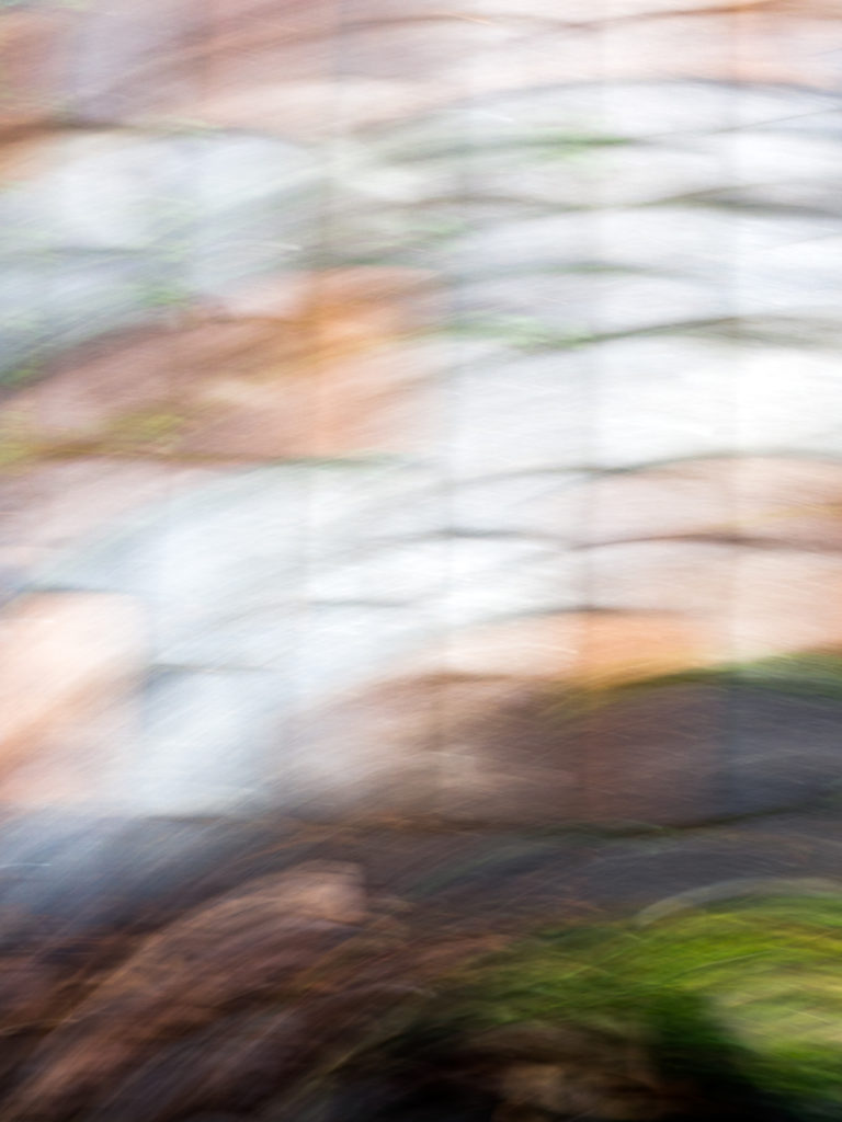
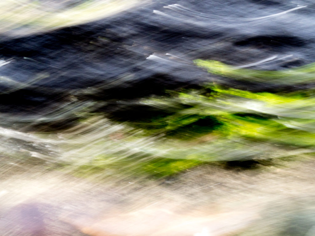
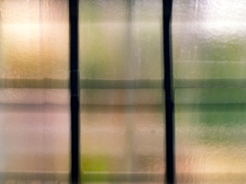
Man, this project was a roller coaster. I decided to try out Tony and Chelsea’s abstract impressionist concept that they teach here:

Unfortunately I don’t live near a beach or any expanse of land, really, so I attempted it on a much smaller scale. I literally just walked around my tiny yard and through my neighborhood looking for anything I could shoot with a long exposure while moving my camera. And I was certain that I got nothing usable. They all looked either too recognizable to call abstract or just so bland. But that’s why we have post-processing, right? 

First, the shooting process. I shot manual so I could set a low ISO, a high f/stop and adjust my shutter speed to taste. I made sure that the shutter was open enough to gather light but not over expose the images too bad, but still gave me enough time to move the camera while it was open. Since I wasn’t shooting a vast landscape though, it was much harder to move the camera and keep even horizontals and not have them curve. So after a while I just went with that, moving the camera in different ways to find good shapes. It really just took a whole lot of shooting crappy images and trying repeatedly.

So once I brought my shots into Lightroom I picked out a few that I thought might have potential. I looked for interesting shapes and color. Once I found that, I adjusted my exposure and contrast and then just experimented with color. I used split toning to adjust the color of shadow and highlights. Since the project was abstract, there was no reason to worry about the colors looking realistic, they just needed to be pleasing! It wound up being a really fun experiment.


f/22, 1/2 sec, ISO 200


f/22, 1/2 sec, ISO 200


f/22, 1/2 sec, ISO 200


f/22, 0.8 sec, ISO 200


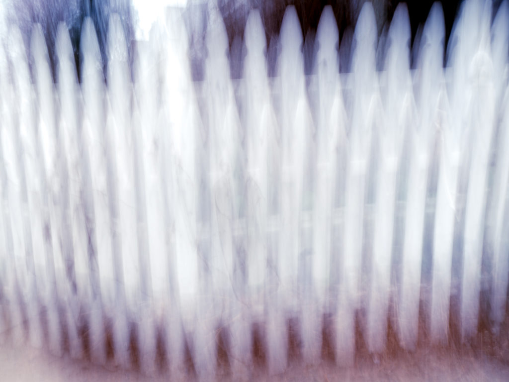
While there are recognizable shapes in each image, they are moved to the point of being surreal. The third shot is my favorite, the motion wound up looking like waves. The last shot of the fence turned out looking very sinister to me which I liked, so I leaned the colors towards red and black to add to the mood.

I think as a whole these were more successful than my first attempt at abstract last year.

What do you think? Are these visually appealing or do they just look accidental? I had a lot of fun with these in post, even though while I was shooting I felt like it was all a loss. I can’t wait to see what everyone else comes up with for the live show this week.

Posted on

Live Show Recap: Lines

We’re back! Well, kind of. Chelsea got sick in Thailand and between that and jet-lag, she had to cut out before the live show. So Tony held it down solo this week, with the help of Justin and me of course. 

We looked at your “lines” photos, and there were some great ones. Next week we’ll be looking at your long exposures.

We enabled “super chat” on YouTube which is very weird. You can pay to have your comment highlighted, and the more you pay the longer it stays up, supposedly. 

Okay, we get into your photos here, I’ll highlight Tony’s picks below:

Over to me with your questions:

  • in short lighting, do you focus on the closest eye or the brightest eye? The closest.
  • how could a beginner get sponsored for travel photography? A beginner could not. You’d need a lot of experience and tens of thousands of Instagram followers.

Now to chit-chat, the part of the show where you say dumb things to us and we make fun of you.

  • why does Tony always look like he just got out of the shower?
  • do you fall asleep to camera overviews? “Tony the living sleeping pill”
  • HDR hate
  • 90’s choker trend
  • Tony should dye his hair

Ok, time to look at a portfolio! Way too long of an intro to that video, but good job bringing in the action. Gorgeous film reel! Maybe try a different layout for your photos, square crop doesn’t work with everything. Beautiful shots. Tony discriminates against left-handed people, so good job leading with that.

We get back into your photos here:

Back to me for some questions:

  • what would be your perfect camera? You can see his answer here. The closest so far is the Sony a99 II.

Back to your photos:

Last questions from me:

  • how much scouting do you do before traveling? A lot! Google Earth is a great resource, looking at other photographers shots from the same place, hire a model in advance.
  • there’s a Northrup Photo sub-reddit, if you’re a redditor.
  • congrats, Jim! 

And that is our show! Whoo, Tony deserves all the beer for that one. Thanks for watching, and join us next week for your long exposures as well as the triumphant return of Chelsea.

Posted on

Beginner Photography: Lines

Hey folks! This week’s topic was a fun one: lines. I like these abstract topics, partially because I’m lazy and partially because I just like abstract photography. Not that these images had to be abstract, but that’s what I tend to when shooting something simple.

The problem I came across with almost all of these shots was a lack of focal point. So some of these wound up being more like location scouting for when I have a model (most likely my daughter) to put in the scene at a later date. I actually love simple, stark shots of man-made structures especially. I think it’s something about finding a rare blank space in the city.

As usual, I shot in aperture priority at my lowest aperture. Some of these shots were of repeating patterns, so it makes the most sense to choose a small focal point and let the rest of the image blur. It helps to eliminate background distractions and your brain fills in the rest of the pattern for itself.

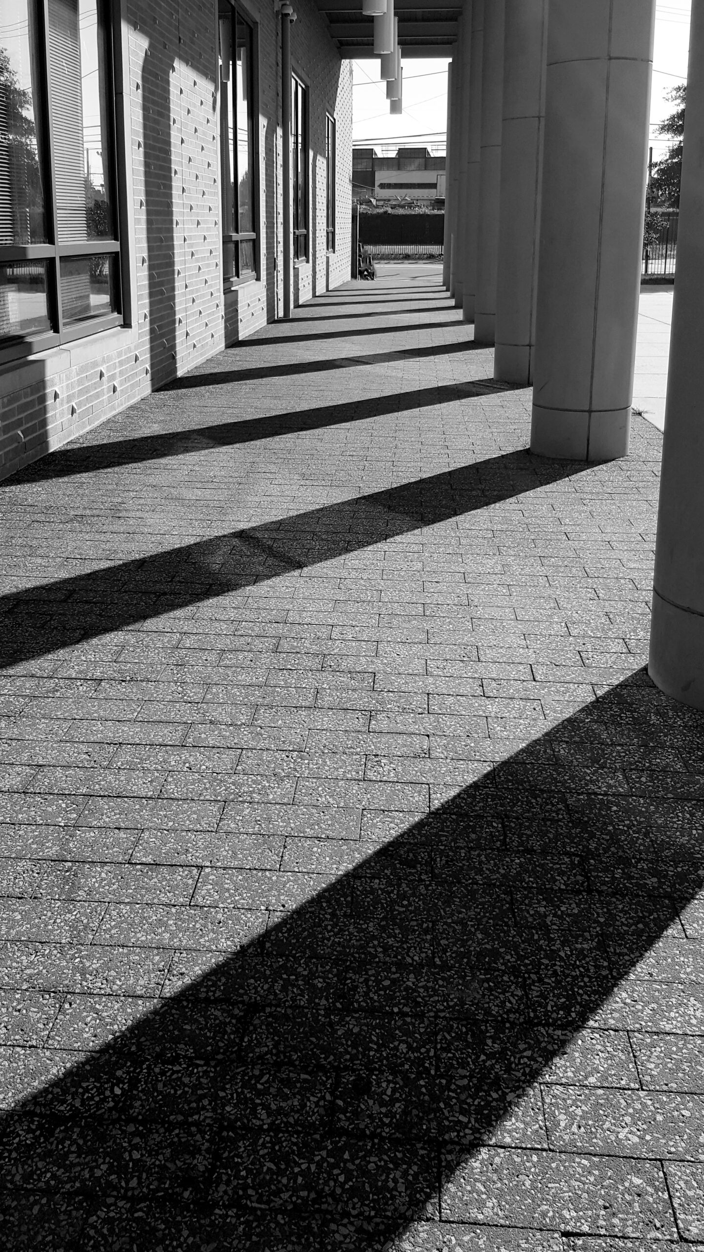
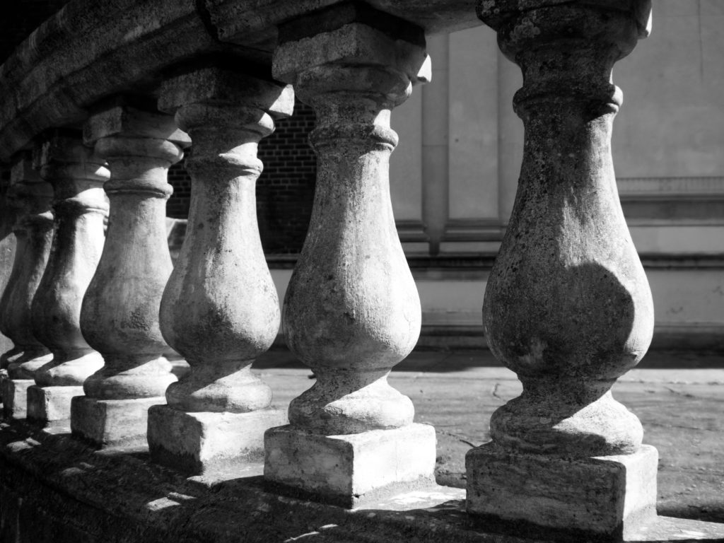
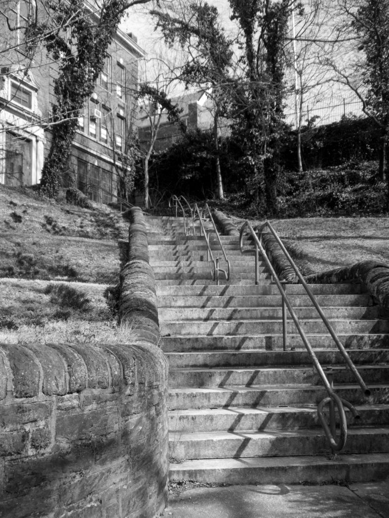
I walked around my neighborhood looking for lines and patterns. I first went to the train tracks, but where I live they are just in a straight line, which doesn’t give a very interesting leading line. Those shots wound up being unsuccessful. The sun was high in the sky, though, which made for lots of nice shadows. I sought out a few staircases that I thought would serve as a good subject. There were also a number of stone railings I liked. I converted all the shots to black and white since the pattern and texture were the focus.

This was actually an old shot from my phone that I loved but found no use for.

There is a person sitting at the end, but I wish they were larger in the frame.


This is a spot I’ve shot before, in my post on architecture. I think this crop works a bit better.

f/3.5, 1/800th for some reason, ISO 200.


This spot you’ll recognize from my “spooky” shots here. It could certainly use a focal point, but I love the zig-zag shadows on the stairs.

f/4, 1/640th, ISO 200.


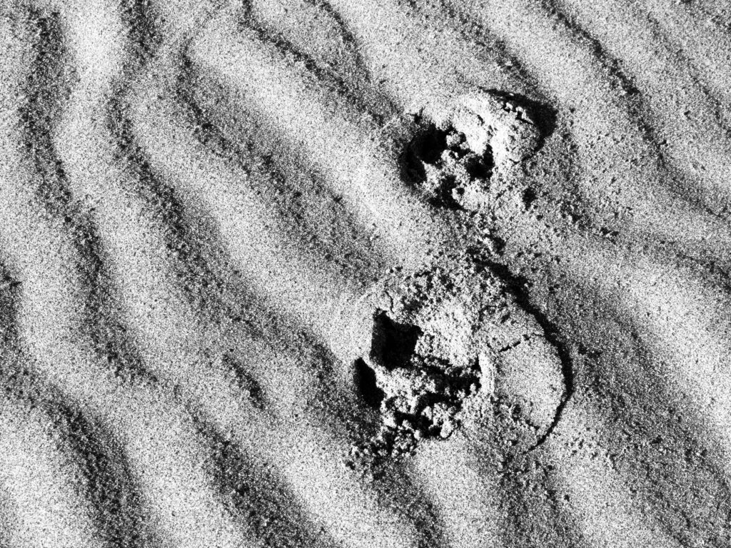
Another old shot from when I was in San Francisco. Pup prints.

f/9, 1/200th, ISO 200.


So, there’s lines! I’m really looking forward to seeing everyone’s interpretations for the live show this week. What do you think of my shots? At all compelling, or just boring? 

Posted on

Live Show Recap: Shadows

Hey there! This week was a fun one, I love more abstract concepts like this one. This week the subject was shadows (you can see my blog on the subject here.) We got some great submissions. Next week we’re doing natural framing, which I love!

AHHHHH the first 4 episodes of our new travel show, Wanderlust, are out now! Only the first episode is listed, but there are links below each video with the link for the next episode, shhhh.

In two weeks we’ll have the very talented fashion photographer Roxy Rodriguez on the show!

Ok, so we start the show, inexplicably, by going over to me with a single question:

  • plans on going south for the solar eclipse? Nope!

Ok, let’s look at your photos:

Now for some photo news:

Now some chit-chat! The part of the show where you say things and we make fun of you maybe:

  • how to turn on notifications for YouTube channels? Click the little bell next to the Subscribe button and choose “turn on notifications”
  • tips on how to be chill like Tony? Have a cool hobby, be Tony.
  • Captain and Tennille of photography? “Are his eyes real or is he one of those cave cats?”
  • millennial hate is booooooring
  • who is choosing our thumbnails? No one! They’re arbitrary. “Yeah, we’re not great at YouTube stuff.” “I don’t know how we got here.”

More questions?

  • any tips on lighting senior citizens? Don’t underestimate people’s vanity. Side-lighting is a no-go. Use a big softbox on axis with the camera if you’re looking to eliminate wrinkles.

Now let’s look at a portfolio! Hey Matthias, that’s a weird way to sign off. Lovely shots. Kinda weird layout, but great having the images full-screen. Pare down some images, combine the categories, simplify.

Over to me for a few more questions:

  • wanna visit Dubai? Yes.
  • any tips for shooting a wedding on top of a mountain? Pack light, dress accordingly, bring oil blotter sheets. Use Google Earth to figure out the lighting and landscape to plan ahead. Watch your alcohol intake in high altitudes!
  • how do you see the future of photography due to people learning online? Chelsea says better work due to more people being educated and exposed to it. Trends come and go quicker, they make people have to be more experimental. The format is a good challenge.

Back to your photos!

  • two of a kind
  • motorcycle selfie
  • mirror image
  • ski lift (Kyle Medina!)
  • parkour 
  • oh heyyy I got a pick! “Girls are so smart.”
  • three men accidental composition
  • “they make these goofy dummies look like big dangerous animals

Questions:

  • rude dudes
  • how to overcome photo pricing low-balling? Call um cheap. Let them go with the better deal, you can’t convince someone of your value. Some projects are worth parsing out with them though, you can’t cheap out on a wedding.

Back to your photos:

A few last questions:

  • wildlife body? D500 for flying birds, but the 5DSR is the home set-up for backyard perched birds.
  • how to get shots of running dogs and get the eye in focus? Your focusing points make all the difference.
  • rumored RGBW sensors in future cameras? Yes! Very technical explanation to follow.

Speeding through shots at the end of the show, here are some standouts.

And that’s our show! Check out Wanderlust at sdp.io/WL1 and join us next week for “natural framing.” Thanks guys!

Posted on

Beginner Photography: Abstract

I’m back! For those of you who don’t know me (impossible!) I do customer support, video editing, and moderate the comments on TCLive for Northrup Photography. What I am not is a photographer. I’ve always loved photography, and all art, but haven’t had the drive to learn. You’d think working for Tony and Chelsea for the past year and a half would get me moving, but work can get in the way of art if you let it. Turns out I learn best with a task to complete, so I’m going to write this blog one day a week so that I can learn photography and hopefully some of you can learn along with me! I’ll be hashtagging some of my photos on Instagram (@SiobhanKyle) and using the hashtag #StunnersOnInsta to show my progress. I encourage you to do the same! There are tons of great photos on there already from our YouTube community.

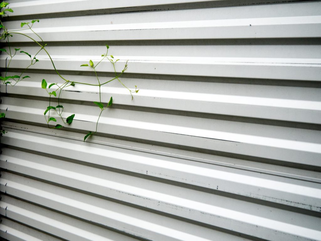
This week I took inspiration from our live show and decided to work on some abstract shots in my house and on the street. I can’t say they were totally successful, but it was a fun challenge. Abstract art is actually one of my favorite genres. I love looking at things in a new way and finding the beauty in things that are often overlooked. A successful abstract can make everyday objects look otherworldly. It’s a method of capturing an object out of context or zooming in and framing an object in a way that makes it unrecognizable. You can do this in a few ways:

Zoom in

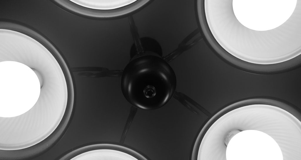
20160801_182319_002This view of an overhead light is not what you generally see when you walk into the dining room. But by getting directly underneath it and zooming in, cutting into the edges, you get an unusual take on a simple object.

Play with shapes


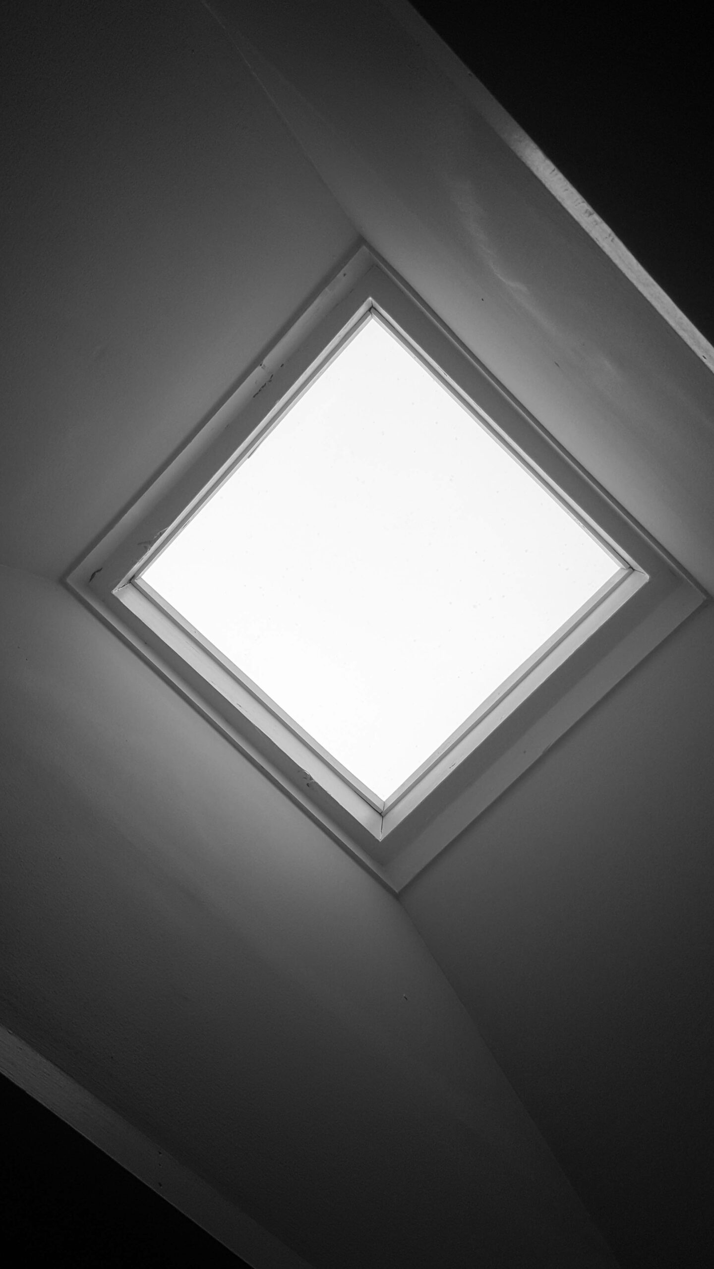
20160801_182422

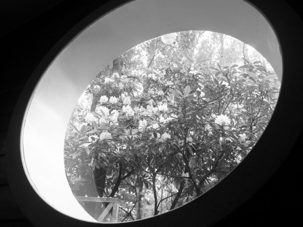
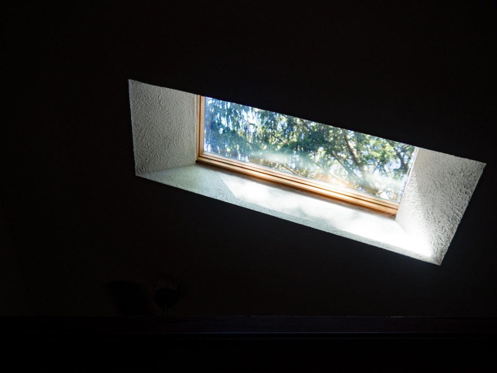
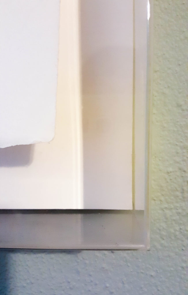
Look for interesting angles, leading lines or patterns. This view of a skylight turned on its side made the image more interesting than if it were just square.


Use light and shadow

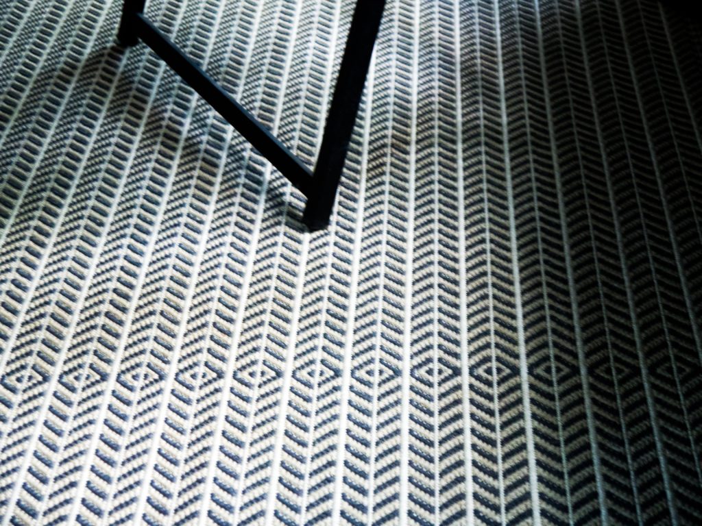
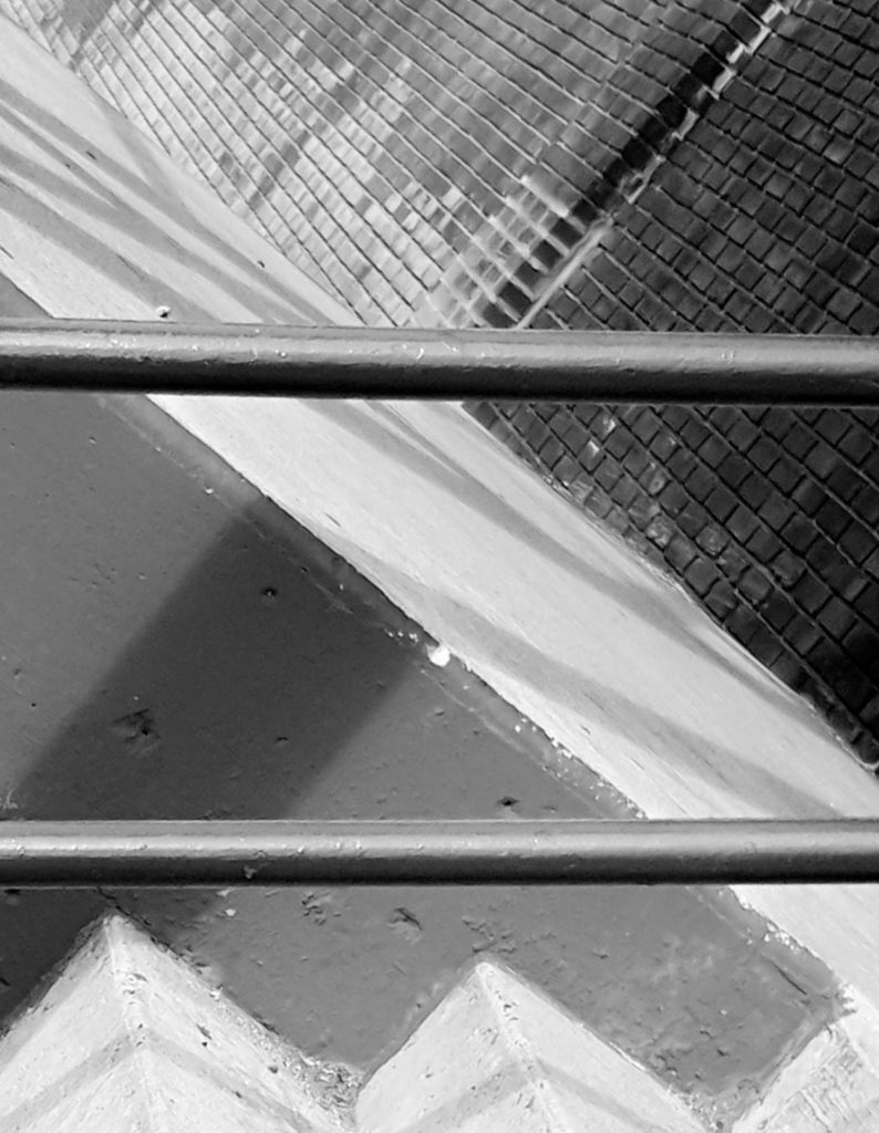
20160801_182726 Dramatic lighting adds visual interest by playing up contrast and texture.


 If all else fails, go black and white

20160802_084556

Black and white is always a great way to abstract your image and bring attention to shape and texture.


So those are my efforts. I know a lot can be done in post processing, but I’m not at that level yet. I did some color and saturation tweaks as well as some creative cropping and converting to black and white in Lightroom. What tips do you have for making abstract images?

 If you wan to learn more about making abstract photography, watch this video or check out our past live show on abstract photography here.

Posted on

How to Turn Your Simple Pictures Into Art

SpaceStationNaples
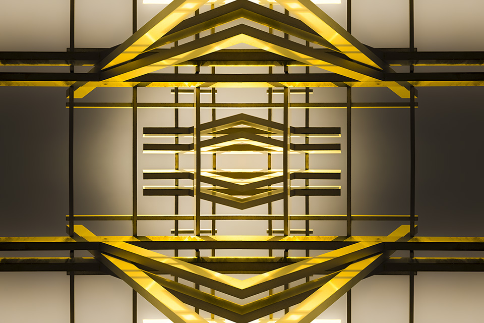
This was originally a shot of some girders from a parking garage overhang.

The Philosophy

I won’t take too long with this since my last post was all about artistic vision and philosophical ramblings. This post is meant more as a tutorial. However, there are a few things I would like to share here. Sometimes, my goal when I am out and about shooting is to capture something other than abstract ideas. That is, I may be out with the goal of doing some self portraits or a few landscapes at the beach. However, the light or weather refuses to cooperate. Sometimes, I lose the mood. Whatever the case may be, I feel that if I am out there with my camera, I need to find something to shoot so I can use the photos as a sort of “bank” I can draw from whenever I need to. I have thousands of images on my computer that I can turn to whenever I am in a creative “rut” because of this. (I am the photographic equivalent of those poor folks on the show ‘Hoarding : Buried Alive’ lol.)  I shoot tons of “throw-away” images that, later on, prove to be very useful in creating some very interesting and at times, award-winning images. I take shots of geometric patterns, shadows, and architecture. When I am taking these shots, I try to keep in mind that they will be used to create an image that will look FAR different from the image my camera captured. They don’t look like much out of the camera, but hopefully the tutorial below will help make your photos look like a work of art 🙂

Continue reading How to Turn Your Simple Pictures Into Art