Posted on

Use Reflections to Add Interest to Your Photographs

A building reflected in water

As photographers, we use our cameras to capture two dimensional images of our three dimensional world. Via aperture, focal length and focus, we manipulate our photos to give them dimension. We do our best to set them apart from casual snapshots.

Another way to create a sense of depth and interest in an image is with the use of reflections. They can support a subject, be the subject, or even link elements of an image together in creative ways, resulting inĀ a photo that rewards the viewer for looking more closely at your shot. It’s these types of engaging images that can set your work apart from a sea of sameness. Continue reading Use Reflections to Add Interest to Your Photographs

Posted on

Dreamy Outdoor Portraits

Often times I am asked how I achieve the soft, dreamy bokeh backgrounds in some of my outdoorĀ natural light portraits. I would love to share with you some of my techniques for this look.Ā The majority of this technique is done in camera.

redcoat

My favorite backdrop for portraits such as these are the leaves of trees. Often times though, myĀ subject is a child and the leaves of the trees are too high up to be behind them! To adjust for this IĀ like to set my subject on top of a picnic table, standing on a boulder, or on the top of a hill. This bringsĀ them up to the level of the tree and I let my angle, lens, and focal compression do the rest.Ā WhenĀ placing a child on top of a table or high surface be sure to have an assistant or your model’sĀ parents right next to them for safety.

A few tips for maximum depth of field, bokeh and soft creamy blur:

  • LongĀ focal length. I prefer 100-Ā­300mm. Zoom your lens in as far as it can go, this will giveĀ you the softest blur. My go-to lenses for these types of portraits are the Canon 70-Ā­200 2.8 and theĀ Canon 135mm f/2L. Any long focal length and wide aperture lens can achieve the same look.
  • Ā­Wide aperture. I prefer 2.8 or wider. This really helps isolate your subject from the background,Ā and will make them pop.
  • Ā­Distance of background to subject. The farther your background is from your subject the better!
  • Ā­Distance of subject to your camera. For this I will get the closest to my subjectĀ that will allow me toĀ be zoomed all the way in toĀ frame them.
  • Ā­Angle. Angle your camera to get in as much of the background behind your subject as you can,Ā being careful not to shoot straight up atĀ your subject but to be around their eye level.

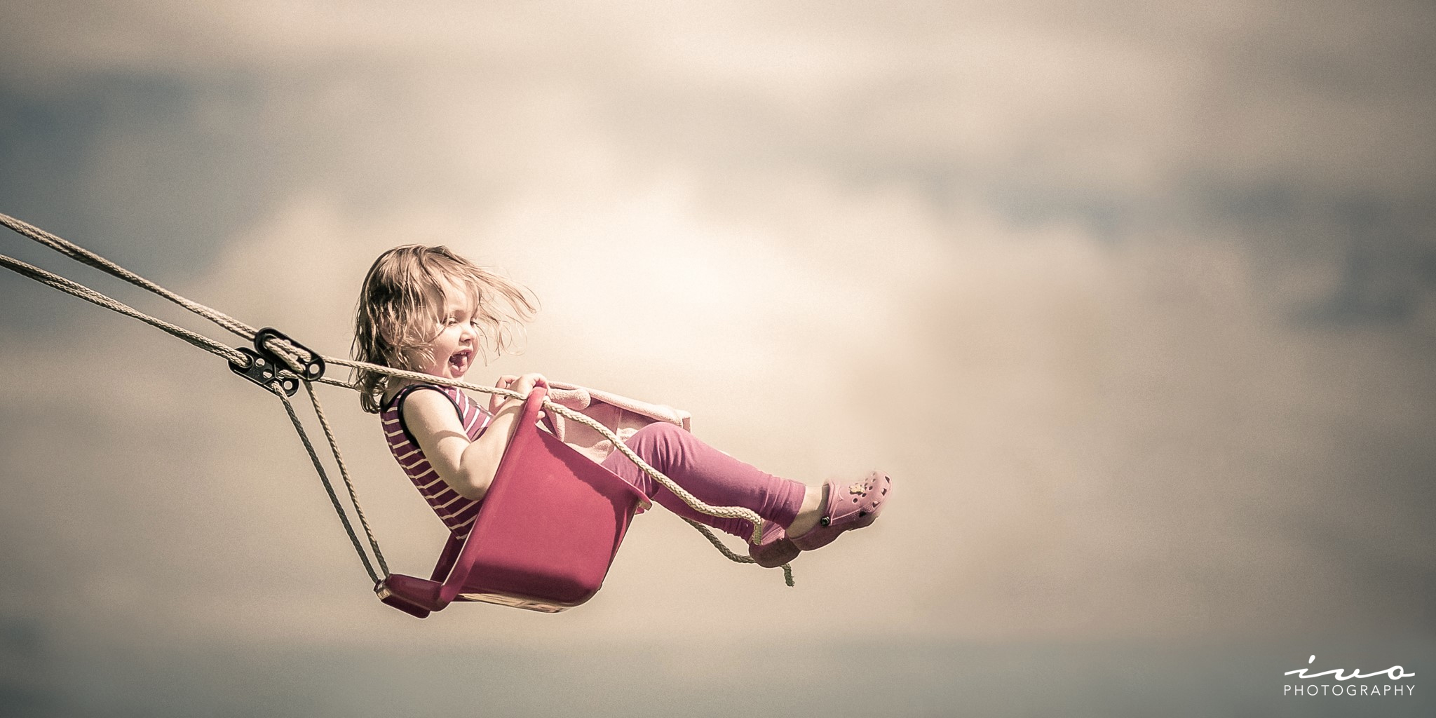
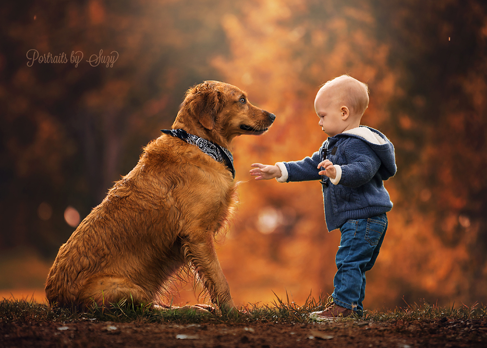
Here is an example of Little Cash with his doggy standing on a hill with the background very,Ā veryĀ far away.

Baby and dog

A few tips for great light using only natural light.

I decided to learn to use available light and natural light for the sole purpose of being able toĀ concentrate more on my subject. I find extra gear cumbersome and will even bring just one lens toĀ a shoot. I photograph children and find it easier to work without extra gear.

  • Ā­Position of the sun. Try to use a location where the sun will be barely peeking through the leavesĀ of the tree behind your subject. This can add rim light to your subject and bokeh in yourĀ background.
  • Ā­Position of your subject. Try to have your subject facing a big open sky, but not facing the sun. AĀ big open sky without trees will let maximum light get to your subject, lighting them up and addingĀ pleasing catch lights to their eyes.

dakota

A few tips for child portraiture.

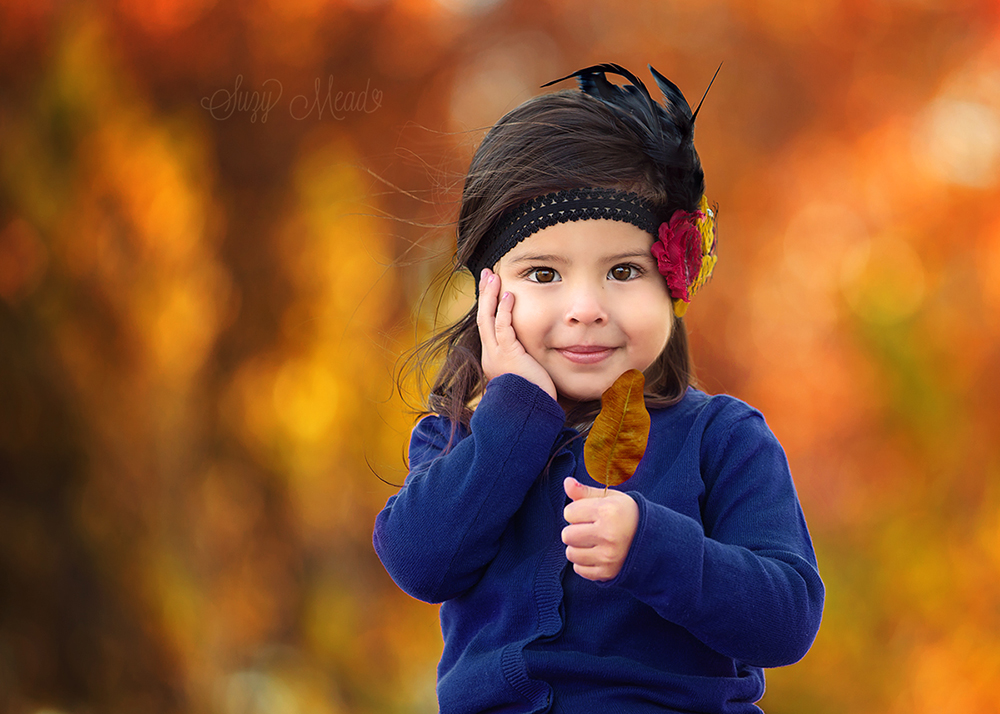
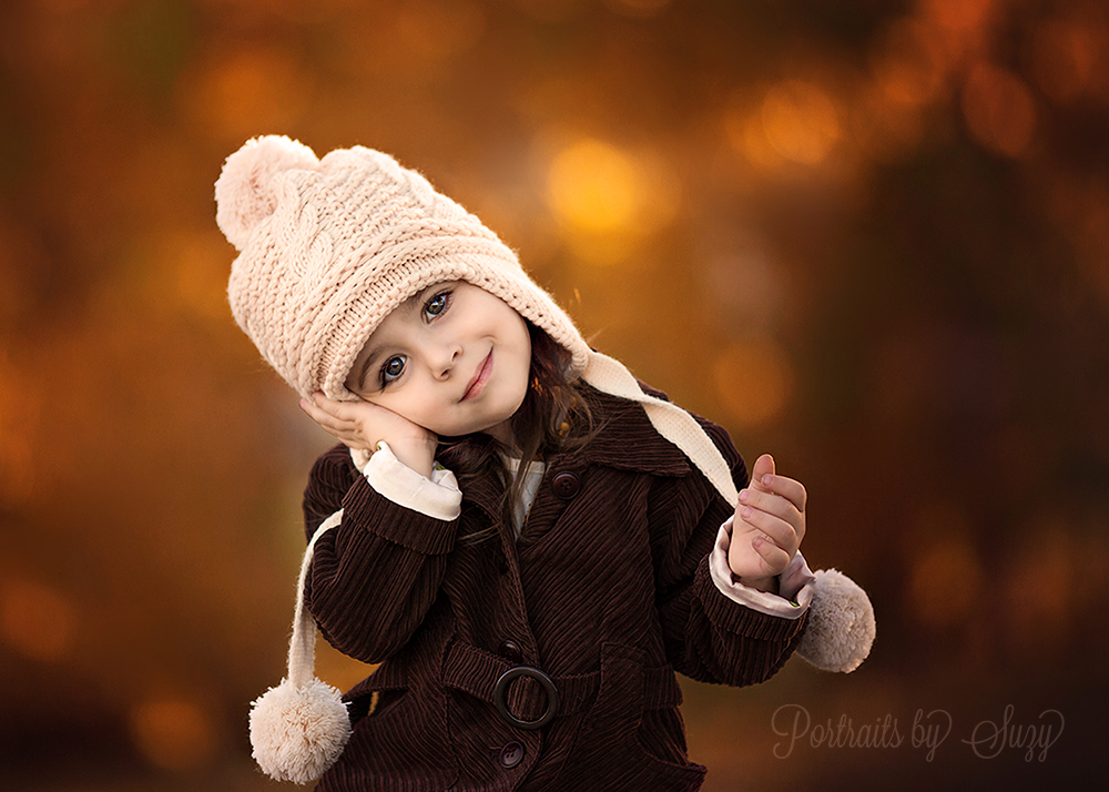
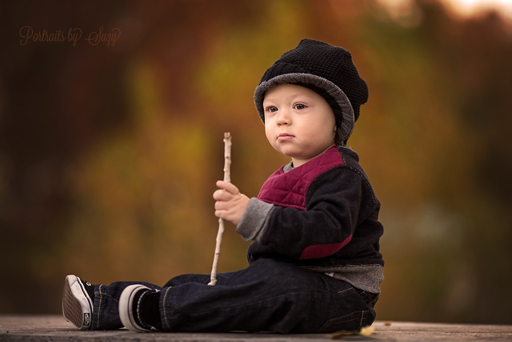
Children feel more secure and relaxed when they are able to hold something. I like to findĀ something outdoors for them to hold. You can use a pine cone, a leaf, a stick or a favorite toy.Ā For very young subjects playing peekĀ­aĀ­boo behind your camera is a great tactic.Ā Try to ask for a pose, say ā€œcan you do this?ā€ And then show them! Sometimes it works, sometimesĀ not but it is worth a try! My favorite is the hand on cheek pose and I’ve been lucky to get it a fewĀ times.

  • Ā­Fast Shutter speed. Children move very fast and that perfect expression may be so short you willĀ be lucky to capture it. This lucky shot of Norah was literally a fraction of a second long. Don’t beĀ afraid to do some rapid firing when photographing small children. This portrait is also an excellentĀ example of using complimentary colors, orange and blue.

norah

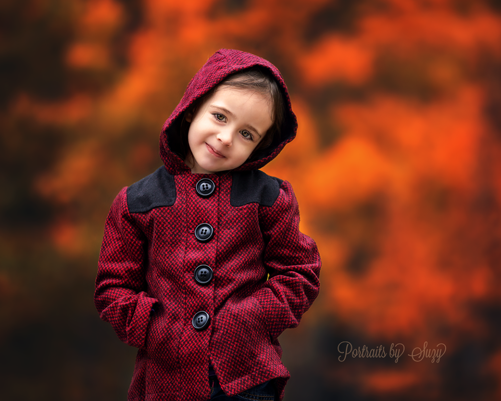
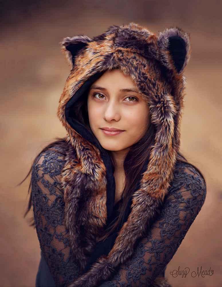
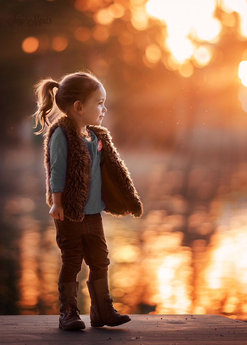
Lastly I would like to talk about wardrobe. Choosing the right outfit, accessories and colors forĀ your subject to wear can make a huge difference in the overall quality of your portrait.Ā Texture in clothing is wonderful for portraits, it adds a sort of 3d quality to your image withoutĀ being distracting. Think lace, knit, corduroy, fur and embroidery.

Colors are important as well. Think about the background you will be using, will the tree be green?Ā Will it be fall colored? Orange, red, green or yellow? Then use a color wheel to find a contrasting,Ā complimentary or monochrome color to coordinate, or choose a neutral color like brown or cream.Ā Solid colors are best; prints,Ā stripes and plaid can all distract from your subject.Ā I tend to stay away from white as it is so bright and can distract from your subject.

A simple sweater, or textured shirt is great and can stand the test of time, when you view theĀ portrait years from now will it look dated? This is something to consider.

Here is an example of Mia wearing textured neutral clothing and doing the hand on cheek pose.

sweet mia

A few more examples of texture in portraits:

texture portraitboy holding stick

Little girl in autumn light. Beautiful rim light at sunset

by Suzy Mead atĀ http://www.portraitsbysuzy.com/

Catch up on our other photography tips here!

Posted on

Beginner Project Series: Fun Colors

Well, this is embarrassing. I’ve worked for Northrup Photography for over a year now, but I still don’t know how to take pictures. I mean, I know how to press a button, but you know that’s not what it takes. So it seems well past time for me to actually begin the learning process. It’s the getting started that scares me. Where do I begin? Well, by taking pictures, I imagine. So I’ve done that a bit.

I studied photography in high school (with Chelsea, actually!), and I took photography classes my one year in college. I loved it. I loved the way my view changed, the way that I saw everything as a potential photograph. But then life happened, carrying around a big DSLR (and boy were they big back then!) never seemed practical. Without the constrains of school, I didn’t have the motivation. So I realize now, to get back into it, I need to give myself a project. And what could be easier than using the show I am on each week? That’s right, the live show submission topics! This week’s theme coming up is broad: fun colors.

I happen to live in a city, and don’t have a car, and work from home. So I don’t get out much. And frankly, it’s getting a bit cold, and my house is cozy. So I’m cheating this week and using a photo I took a few months back when I was in CT visiting my family. My mother took my daughter, Eloise, and meĀ to the aquarium. (I don’t really endorse aquariums, but my mom was paying and my daughter was excited. Who can say no to that?)

I took along my borrowed Nikon D3300, a good little beginner camera. My favorite shots were the ones I took of indoor aquarium life, the seahorses, jelly fish, and sharks.Ā My photos were noisy, for sure, but I captured a lot of color.

One of my favorites was this little guy

DSC_0097

ISO 25600 f/5 1/40 sec

Great light, movement, and color. And I love an abstract. So for the color project I decided to just make it a little more dramatic, with the few tools I know. I imported it into LightroomĀ and cropped it a bit to take out the dark edge on the left side. Then into the Develop Module to do some split toning. I adjusted my histogram and checked to make sure I had some bright whites and dark blues (in this case, no blacks.)

split tone

I chose a blue hue for the shadows to darken them and reduce the appearance of noise in the background (not the best technique, but it worked!) and make the image more dramatic. I chose a yellowish green for the highlights to make the brighter spots pop.

And that is that.

Not a huge challenge, but a start. And that’s all I need, to put one metaphorical foot in front of the other.

What do you think? What would you have done differently? Teach me!

DSC_0097


Posted on

The Story Behind the Image

Flying High
Flying High
Flying High (winner of a View Bug Editor’s Choice Award)

Inspiration

Let me tell you about an imageĀ which isĀ trulyĀ special for me. My middle daughter, Amy,Ā loves to swing.Ā As I watched her enjoying herself, the scene brought me back to the carefree times of my own childhood.Ā I quickly ran inside the house and grabbed myĀ camera to capture the moment. I asked my wife to give the swing some extra speed so that Amy would come up higher in the sky, giving the photo that “I’m flying!” feeling.

To me, this capture sums up the best things about being a kid: beingĀ young andĀ free. To laugh and seize the moment, not having to think about yesterday, today, or tomorrow. Life has its simple yet profound moments, and this was one of them.

Continue reading The Story Behind the Image

Posted on

Using Photoshop to Create Dynamic Eyes

I love Photoshop…. No really, I love it.Ā  I can’t believe I’m uttering those words but it’s true.

As a beginner photographer, I had a rough start with my editing.Ā  I had no idea where to start so I resorted to using free programs I found on the internet.Ā  I thought these programs were genius!Ā  They would apply these absolutely horrifying ā€œAMAZINGā€ filters.Ā  I thought my pictures looked fabulous.Ā  I won’t even tell you the name of these programs because if I can spare you the horrific step I made you’ll thank me for it someday.

It didn’t take long before my frustration set in and I realized that my images didn’t look professional.Ā  I justĀ  didn’t have the ability to achieve the results of some of the photographers I admired.Ā  When someone finally asked me to slim their arm, I knew I needed to bite the bullet and get Photoshop.Ā  Using it was another challenge, I was so green that I had to Google how to even open a photo.Ā  That’s how little I knew.

The point of this is that anyone can learn Photoshop.Ā  I knew absolutely NOTHING when I started with it.Ā  If you have a little bit of patience, YouTube, an ebook reader, and a computer, you can go as far as your imagination takes you.

Continue reading Using Photoshop to Create Dynamic Eyes

Posted on

Tips for Shooting Fall Foliage and Autumn Scenes

Fall is one of the most photogenic seasons, but can also be the most frustrating to shoot: the weather can be unpredictableĀ and the intensity of the colors can be difficult to capture.Ā If you don’t live in an area that lends itself to beautiful landscapes, you might end up feeling the odds are against you for getting a perfect fall shot.

Cry no more, friends. You don’t need to live in Vermont to get great fall shots, and if you do, my tips can help you, too.

Remember the Basics

Before we get fall specific, let’s be sure we follow the basics. If you’re taking a landscape shot be sure that your photo is well composed and has depth.

If you’re still uncomfortable or unfamiliar with those concepts you can find detailed information on composition in chapter 3 of Tony’s book, Stunning Digital Photography.

Continue reading Tips for Shooting Fall Foliage and Autumn Scenes