Author: Chelsea
Chelsea is a photographer, model, and photo editor from Waterford, CT. When she's not immersed in photography, you can find her traveling, talking to people's dogs, or singing The Logical Song.
Watch This Nikon Camera Get Crushed by a Hydraulic Press
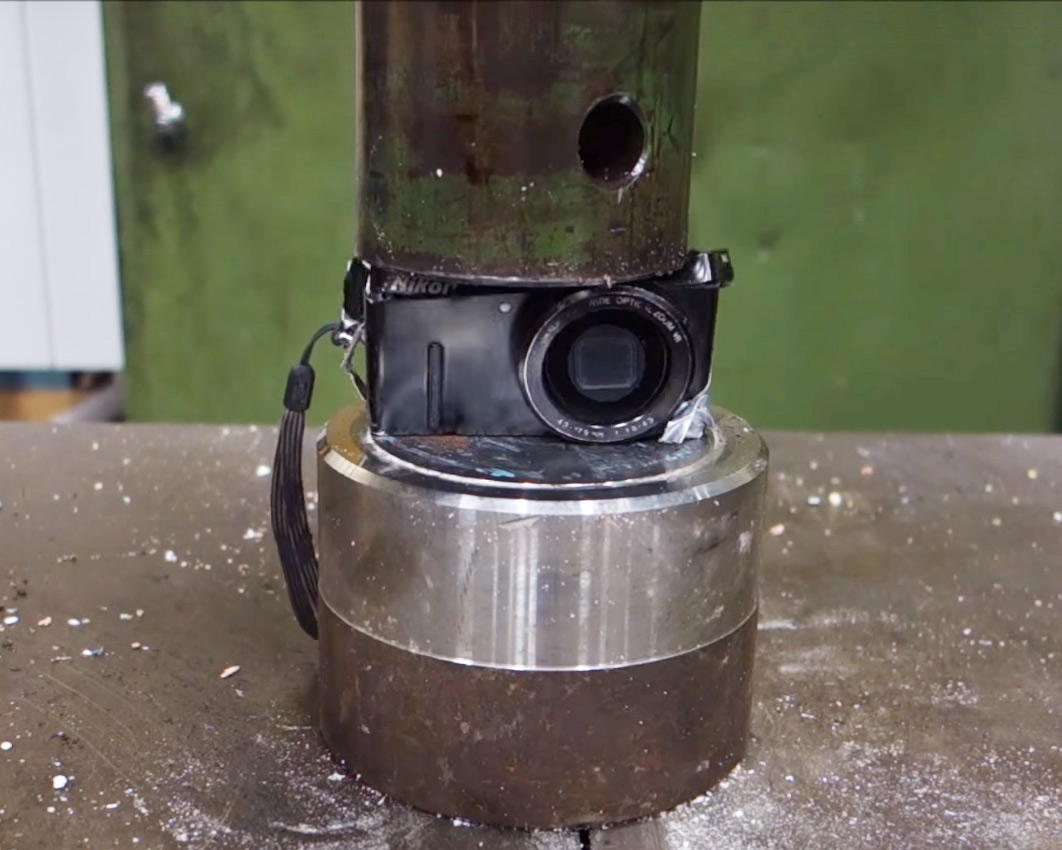
This is a video for all of the photographers that put their lens cap back on after every shot.
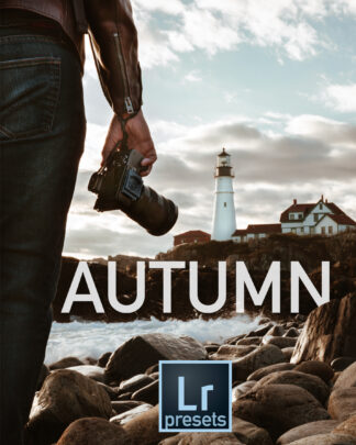
Tips for Shooting Fall Foliage and Autumn Scenes
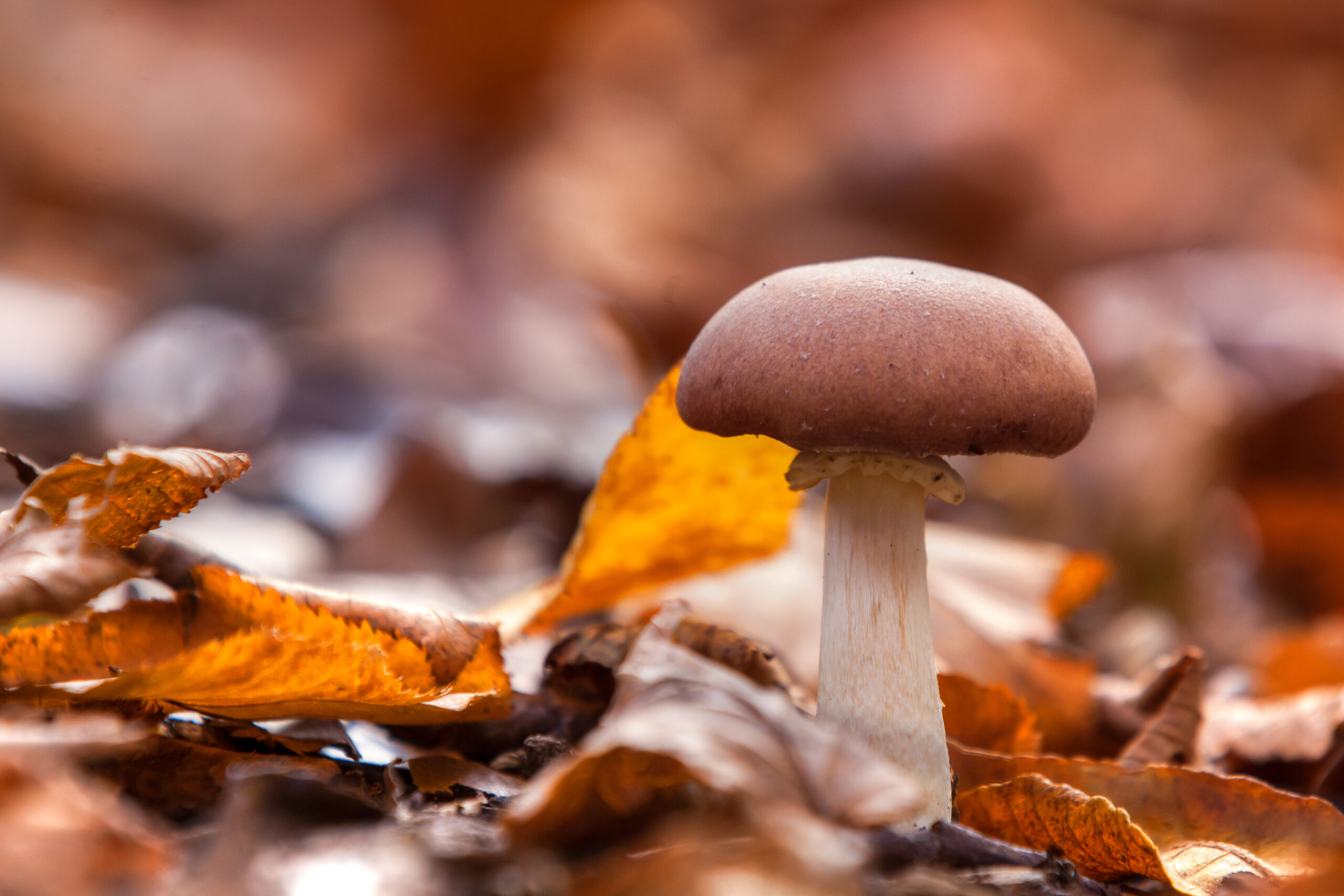
Fall is one of the most photogenic seasons, but can also be the most frustrating to shoot: the weather can be unpredictable and the intensity of the colors can be difficult to capture. If you don’t live in an area that lends itself to beautiful landscapes, you might end up feeling the odds are against you for getting a perfect fall shot.
Cry no more, friends. You don’t need to live in Vermont to get great fall shots, and if you do, my tips can help you, too.
Remember the Basics
Before we get fall specific, let’s be sure we follow the basics. If you’re taking a landscape shot be sure that your photo is well composed and has depth.
If you’re still uncomfortable or unfamiliar with those concepts you can find detailed information on composition in chapter 3 of Tony’s book, Stunning Digital Photography.
Continue reading Tips for Shooting Fall Foliage and Autumn Scenes
How to Load Brushes into Photoshop
I just finished recording a video about how to create clouds, fog, and mist in Photoshop.
As a part of that lesson I gave you kind folks a new brush to help you better create your clouds. If you’ve never loaded new brushes into Photoshop and need some help, follow the simple instructions below:
- Download my brush file and save it in an easy-to-access file.
- In Photoshop, go to your Brush Presets panel by selecting the “window” menu at the top of your screen and selecting “brush presets.”
- Once you’ve accessed your brush presets menu, click the dropdown menu in upper right hand corner.
- Click “Load Brushes.”
- Find the file where you stored the downloaded brushes and double click on the file.
- Enjoy that sweet sweet cloud brush.
- Share your cloud art in one of our private reader groups!
Our Favorite Print Making Service (In the USA)
With all of the options available, it can be difficult to choose which service is worthy of printing your photos. Tony and I decided to alleviate your decision fatigue by choosing ten print providers, via your suggestions and some research, and ordering 8×10 prints for an overwhelmingly exciting print showdown. Take a deep breath, this gets intense.
Testing Method
First, we ordered the prints and took notes on the ordering process. Was the website a pain? Did we have to download a photo uploader? We took the entire process into account.
Once we had our prints we assessed how the prints were sent to us. Some were send in cardboard mailers that could easily bend and damage your photo. Others came fastened to cardboard, donning fancy packaging, and full of free print samples. One even came with candy! I tried not to let the candy weigh the score too heavily, but c’mon, free candy!
Next, we wrote the name of the print provider on the back of each print. Once turned over, each photo would be judged without us knowing where the print came from. We didn’t want to be biased.
We judged each print service on a scale from 1-10 (50 points total) using the following judging criteria:
- Color/Tone/Exposure/clarity
- Finish/weight
- Packaging
- Ordering Ease
- Price
We used a photo with bright highlights and deep shadows to put the printers to the test!
The Winners
Mpix: 49/50
Easy to order, inexpensive, and well-balances, sharp photos. You can’t go wrong with Mpix. The weight of the paper was heavy and finish did not detract from the appearance of the photo.
WHCC: 48/50
WHCC was a very close second. The colors were slightly less rich, but still looked good and was clear and sharp. The ordering was easy, the print was inexpensive, and the print and packaging was very nice. They even included same photos so you can see and feel different photo paper textures and finishes.
Pro DPI: 47.5/50
FREE CANDY! That’s the first thing you think when you open your print from Pro DPI. When ordering from Pro DPI you need to download a photo uploader. Initially the process is annoying, but it’s a one-time annoyance and it’s common. Their prices are reasonable, they ship you your photo with free print samples, and their photos look great, too. They got some points off because the color tones in their print was not as preferable as those in other prints we received and their photo uploader is an initial annoyance.
Bay Photo: 47/50
Bay Photo also provided nice, affordable prints, but was lacking in a few ways. First of all, their website is a bit of a pain. It’s not pretty and requires you to download tools and an uploading tool. They have tutorials if you’re having trouble with their site. Their print was also a bit on the green side, which was especially noticeable with our print since it was a portrait. They do, however, offer some interesting mediums to print on, like bamboo and metal!
H&H Color Lab: 47/50
Overall, H&H offered decent prints. The skin tones were a bit on the pink side and the image seemed a bit less sharp than the others. The website is nice, but you have to log in to their site to order your prints and also requires a photo uploading tool.
Nations Photo Lab: 47/50
Nations offered a decent print, too. The color was fine, but the photo paper didn’t seem as nice as the other prints. Once in a frame, that likely wouldn’t be an issue, or you could order a heavier paper. Another downside to Nations was that the photo, like H&H, seemed to be a bit less sharp than the top 4 print providers. For $1.80, nations is one of the more affordable options!
The Not-so-Greats
CG Pro Prints: 43/50
CG Pro might be a great option for other print mediums, but for a plain 8×10 print they only offered Giclée paper, which reduced the appearance of sharpness for our picture. The special paper made it the most expensive print we ordered, at $8.99.
AdormamaPix: 42/50
AdoramaPix had a website that was quick and easy to use, is affordable, and produced a clean sharp imagine. Their score was severely impacted by the color of the photo, which was very green and unusable.
Walmart: 38/50
Walmart offered one of the more expensive prints, but also managed to be grainy, not sharp, and have terrible color.
Shutterfly: 32/50
Shutterfly had one of the few prints that was so bad it could have been an anomaly. The color was very pink and washed out, highlights were blown out, and shadows were washed out. The print also lacked sharpness.
Conclusion
Based on our testing, the prints were hit or miss. The top six print providers had close enough scores that we think any photographer would have been happy with the prints they made. They all offered good prints at reasonable prices. The prints we had problems with had severe noticeable issues that made them unusable. Could we have gotten a bad print? It is possible, which is why we’d like to hear about your experiences!
You Tell Us
Did you get different results or have other recommendations? Comment below and tell us your favorite print service and why.