
Color Theory: Complementary Colors
Color theory can be applied to all forms of visual art, including fashion and interior design. In this post, we’ll look at how it can be utilized in the realm of photography, dealing specifically with the complementary color scheme.
There are many color schemes available to artists and photographers, and while there are no steadfast rules one must abide by, few color schemes are as striking as the complementary. The words complementary and complimentary are often confused and justly so since they are pronounced nearly the same way. Complementary colors are not two colors that compliment each other per se, but they do enhance or accentuate one another, creating a type of contrast.
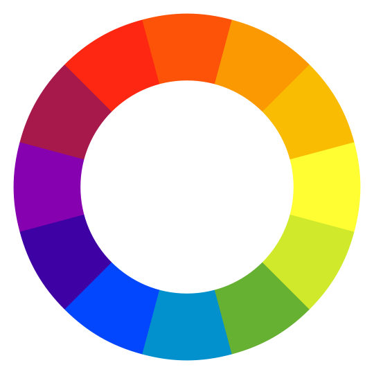
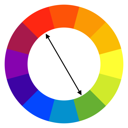
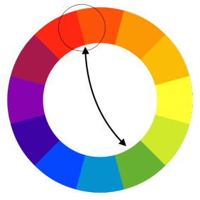
But what are complementary colors? They are two colors opposite each other on the color wheel. If you can learn to visualize in your mind where each color lies on the wheel, you can work out each color’s complementary from memory.
Explaining the other forms of complementary schemes would exceed the scope of this post, so we’ll focus on the basic version as well as the near complementary version which is a subtle and often more naturally occurring variation of what is essentially still a complementary scheme but less jarring
In this post, we’ll be adhering to the rules of a traditional color wheel, not an additive color wheel.
So, why use complementary colors in your photos? The scheme works well if you want to create striking or vivid color combinations. Complementary color combinations are generally considered to be the most contrasting; they create a kind of color vibration. In this way, complementary colors can be utilized to create either tension or subtle vibrance both during a photoshoot and in post.
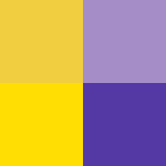
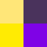
Red and green, blue and orange, and yellow and purple are basic examples of complementary combinations. One way to remember the basic combinations is to remember that each of the primary colors has a secondary color as its complementary. Then, remember that each tertiary color has another tertiary as its complementary.
Stark Examples of Complementary Colors
Bright, vivid hues placed against their exact polar opposites are most commonly found in birds, reptiles, and flowering plants. Otherwise, you will usually only find pure examples in the fashion world, though the effect is often subdued to avoid the risk of having too much visual tension.
Here is a parakeet displaying a very pure example of the red and green complementary color scheme:
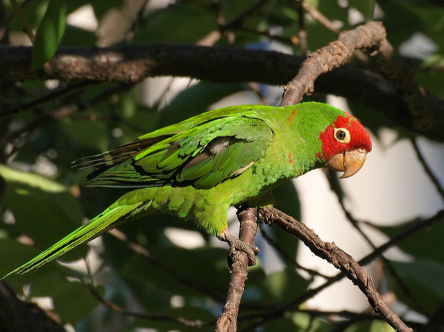

Here, we have some color swatches showing the parakeet’s colors. This parrot displays a nearly exact complementary color combination, with the colors being only moderately darker shades. The top two swatches are a kind of average of the parakeet’s colors; the bottom two are the base hues of the colors. We’ll follow the same format for the rest of the photo examples: the directly observed colors on the top and the underlying hues on the bottom.
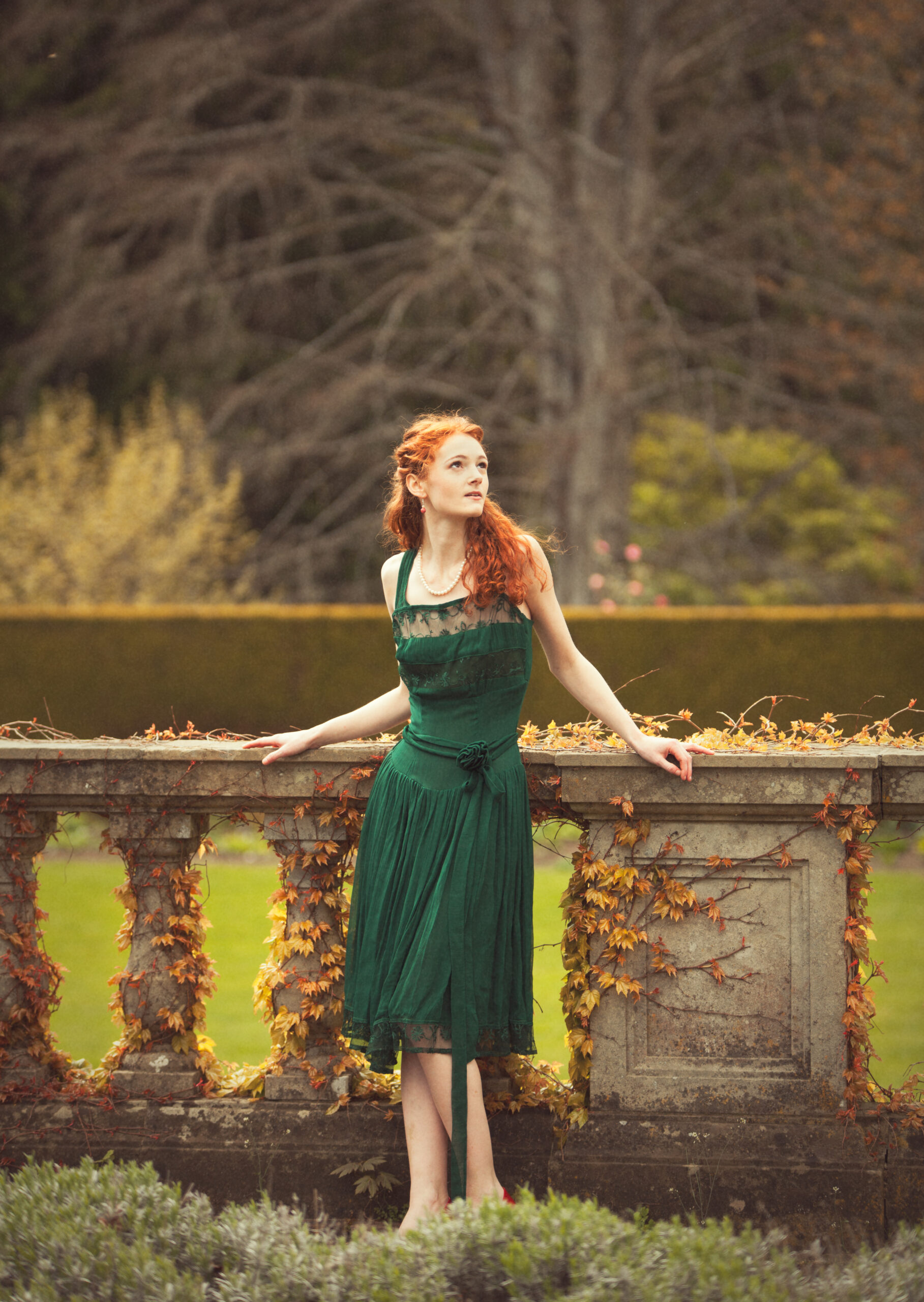
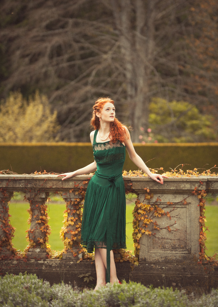
So, fine, a bird is naturally red and green; that’s nice, but how does this apply to photography? Let me show an example of how you can put this color scheme to creative use (we’re mostly going to focus on portraits in this post):
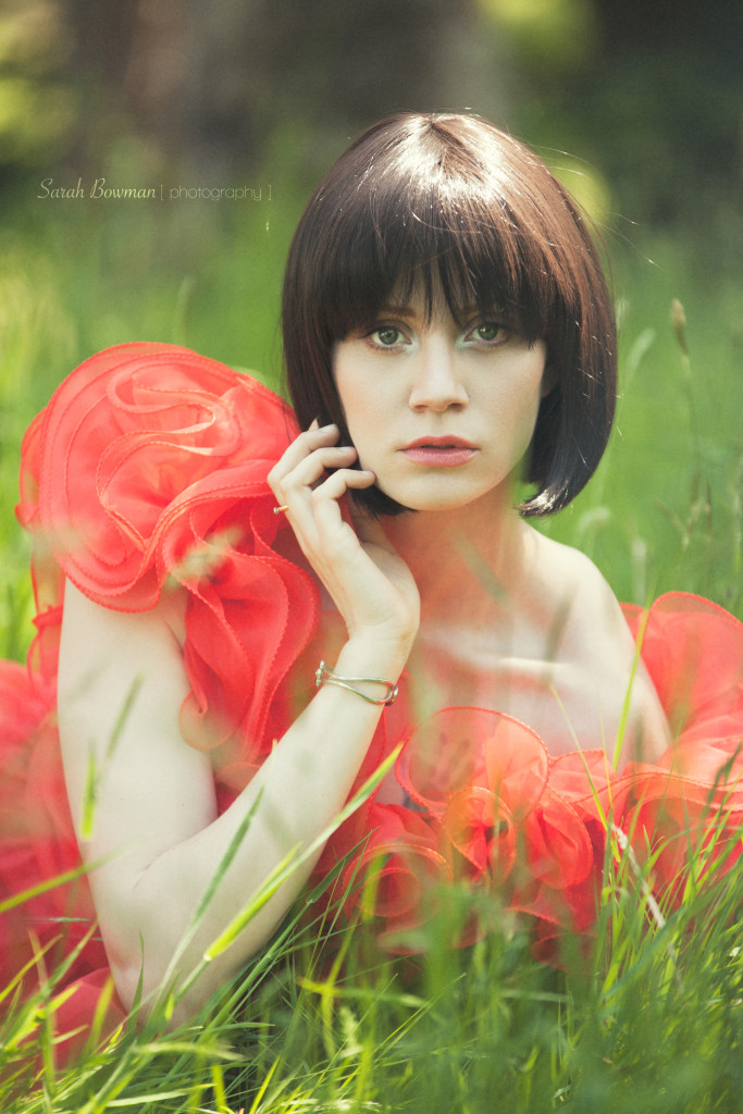

The above image has the subject wearing a red tinted dress. The red tint is set right against it’s complementary color, green. Both the red and the green in the bird’s photo were close to a perfect polarity between colors; you have a bright, saturated version of both colors nearly directly opposite each other on the color wheel. In the example of the model in the dress, the dress contains lighter tints with darker reds in the shadows, and the green is toned down. But, strictly speaking, a complementary scheme doesn’t always rely on absolute hues.
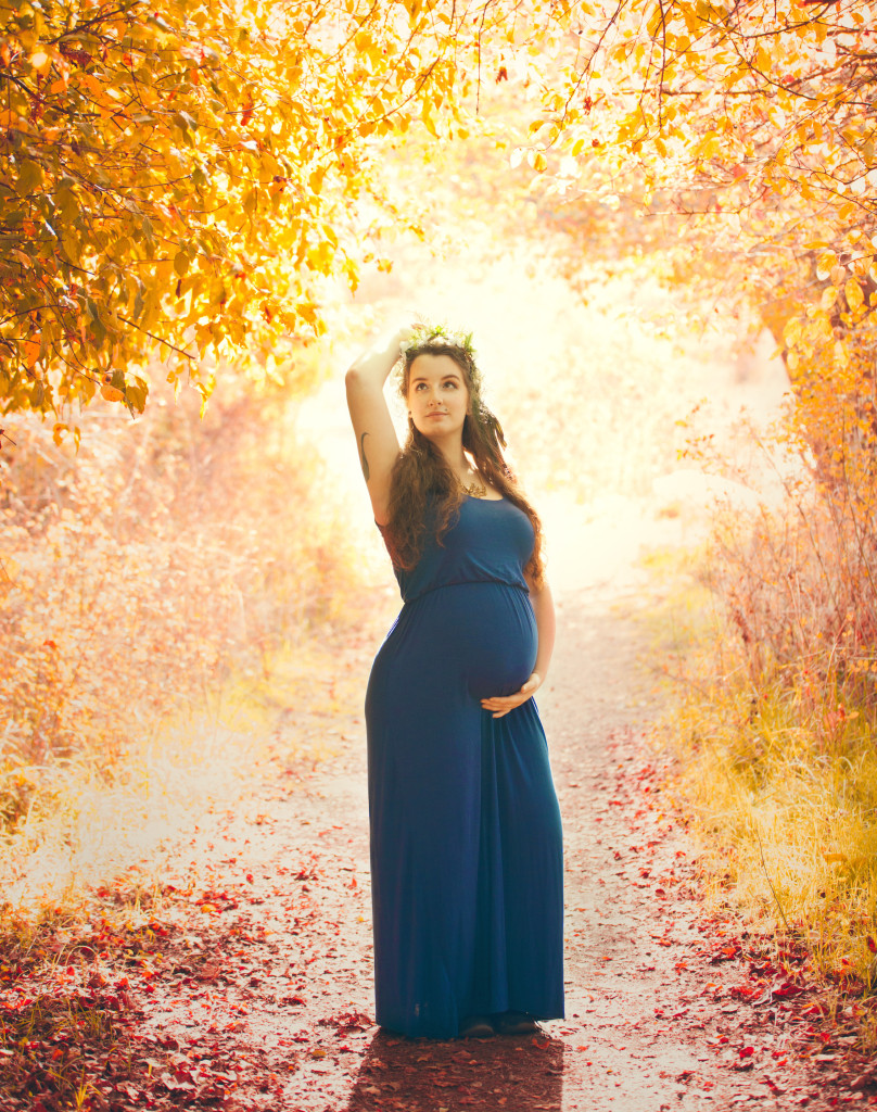
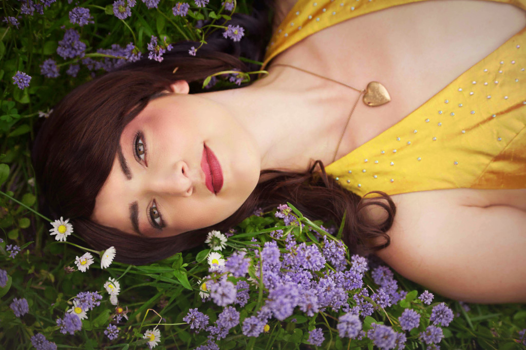
Here are some other examples examples of relatively, but not entirely, pure complementary schemes:

Utilizing the Scheme in Other Ways
Many of the previous images were near complementary. Obviously, in post-processing, you could alter the colors to be in exact polarity, but whether you need to is entirely subjective; starker contrasts are certainly not always better.
So, the more purely you use this scheme the more color contrast you can create, but maybe you don’t want such intense contrast; maybe you want an energetic dynamic but nothing too graphically overwhelming. In the above examples, often one of the two complementary colors is more pure and saturated than the other. You can make use of the complementary scheme without it being overwhelming by either subduing one or both of the colors for a less vibrating but still engaging effect. As I previously mentioned, it’s less common to find perfect complementary color combinations outside of certain plants and animals, but it doesn’t mean that they’re not there is some form such as, often, a near complementary one.
Here is a simple example of where you find subtle and more subdued complementary colors in nature. And still, without adding too much saturation, you can bring out the contrasting colors nicely:
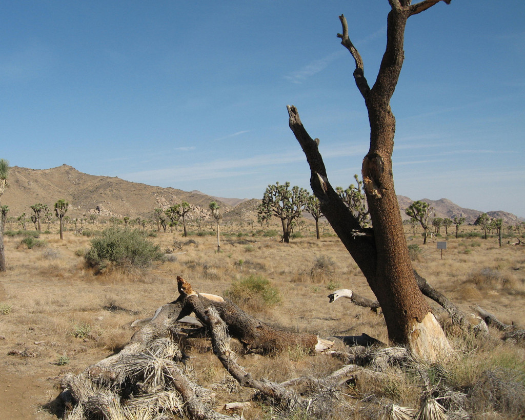
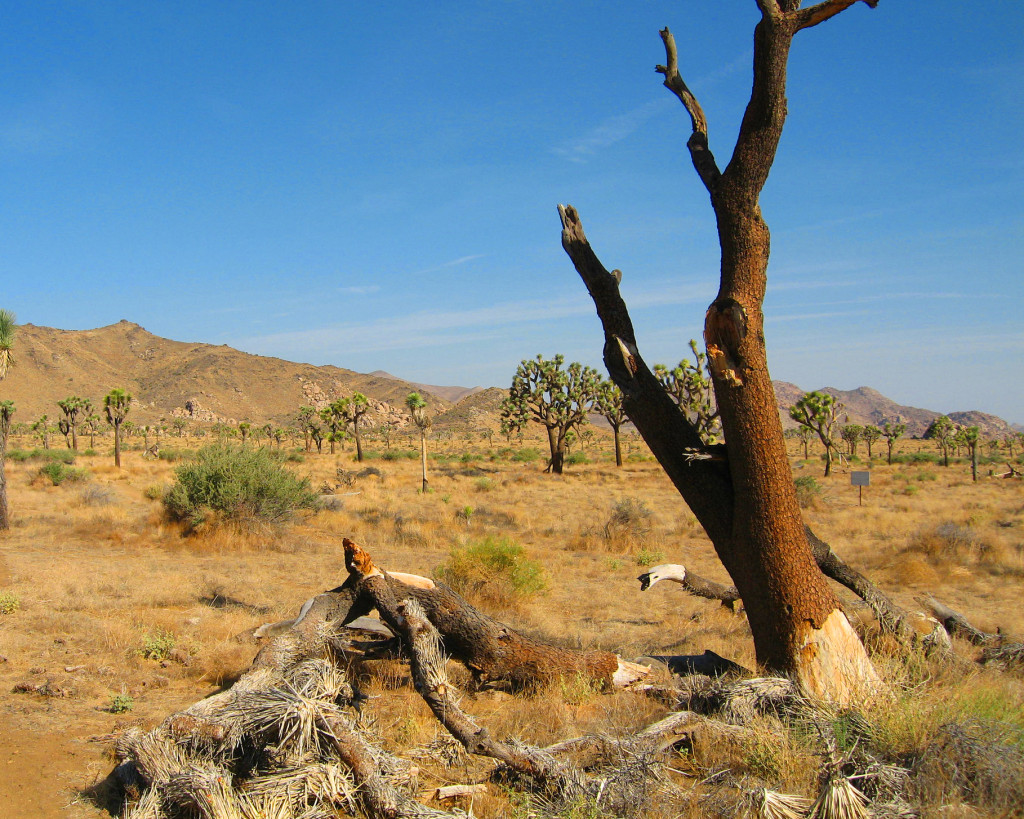
Now, obviously, colors can be brought out in post; this example was simply to illustrate that complementary colors are not particularly rare in their more subdued form, and bringing them out adds energy to an image. It must be done with care, especially if there are other colors in the image.
Complementary Colors Used Subtly
These next images are examples of nicely subdued complementary or near-complementary schemes at work.


There are a multitude of possible complementary color combinations, and there are certainly more details to be delved into, but I hope that this post has helped to convey the value of the legendary complementary color scheme. It can be used both extremely and subtly to add energy to an image either during a shoot or after, and while it may not be the only way to add radiance to an image, it can certainly be very effective.
~ Mike Bowman


Comments are closed.