
Man, this project was a roller coaster. I decided to try out Tony and Chelsea’s abstract impressionist concept that they teach here:
Unfortunately I don’t live near a beach or any expanse of land, really, so I attempted it on a much smaller scale. I literally just walked around my tiny yard and through my neighborhood looking for anything I could shoot with a long exposure while moving my camera. And I was certain that I got nothing usable. They all looked either too recognizable to call abstract or just so bland. But that’s why we have post-processing, right?
First, the shooting process. I shot manual so I could set a low ISO, a high f/stop and adjust my shutter speed to taste. I made sure that the shutter was open enough to gather light but not over expose the images too bad, but still gave me enough time to move the camera while it was open. Since I wasn’t shooting a vast landscape though, it was much harder to move the camera and keep even horizontals and not have them curve. So after a while I just went with that, moving the camera in different ways to find good shapes. It really just took a whole lot of shooting crappy images and trying repeatedly.
So once I brought my shots into Lightroom I picked out a few that I thought might have potential. I looked for interesting shapes and color. Once I found that, I adjusted my exposure and contrast and then just experimented with color. I used split toning to adjust the color of shadow and highlights. Since the project was abstract, there was no reason to worry about the colors looking realistic, they just needed to be pleasing! It wound up being a really fun experiment.
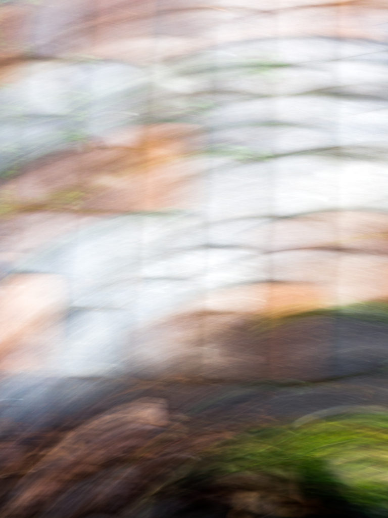
f/22, 1/2 sec, ISO 200
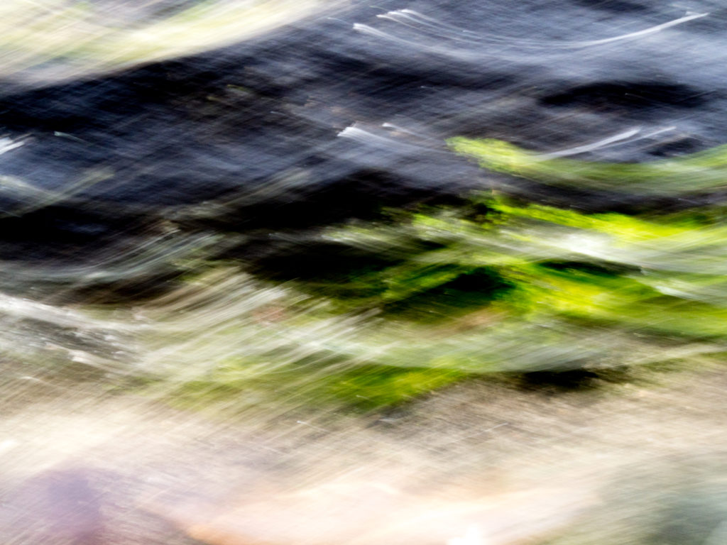
f/22, 1/2 sec, ISO 200
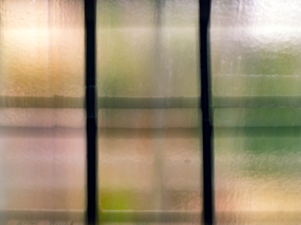
f/22, 1/2 sec, ISO 200
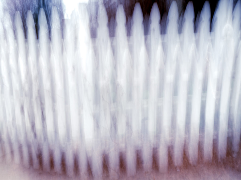
f/22, 0.8 sec, ISO 200
While there are recognizable shapes in each image, they are moved to the point of being surreal. The third shot is my favorite, the motion wound up looking like waves. The last shot of the fence turned out looking very sinister to me which I liked, so I leaned the colors towards red and black to add to the mood.
I think as a whole these were more successful than my first attempt at abstract last year.
What do you think? Are these visually appealing or do they just look accidental? I had a lot of fun with these in post, even though while I was shooting I felt like it was all a loss. I can’t wait to see what everyone else comes up with for the live show this week.




Comments are closed.