Well, this is embarrassing. I’ve worked for Northrup Photography for over a year now, but I still don’t know how to take pictures. I mean, I know how to press a button, but you know that’s not what it takes. So it seems well past time for me to actually begin the learning process. It’s the getting started that scares me. Where do I begin? Well, by taking pictures, I imagine. So I’ve done that a bit.
I studied photography in high school (with Chelsea, actually!), and I took photography classes my one year in college. I loved it. I loved the way my view changed, the way that I saw everything as a potential photograph. But then life happened, carrying around a big DSLR (and boy were they big back then!) never seemed practical. Without the constrains of school, I didn’t have the motivation. So I realize now, to get back into it, I need to give myself a project. And what could be easier than using the show I am on each week? That’s right, the live show submission topics! This week’s theme coming up is broad: fun colors.
I happen to live in a city, and don’t have a car, and work from home. So I don’t get out much. And frankly, it’s getting a bit cold, and my house is cozy. So I’m cheating this week and using a photo I took a few months back when I was in CT visiting my family. My mother took my daughter, Eloise, and me to the aquarium. (I don’t really endorse aquariums, but my mom was paying and my daughter was excited. Who can say no to that?)
I took along my borrowed Nikon D3300, a good little beginner camera. My favorite shots were the ones I took of indoor aquarium life, the seahorses, jelly fish, and sharks. My photos were noisy, for sure, but I captured a lot of color.
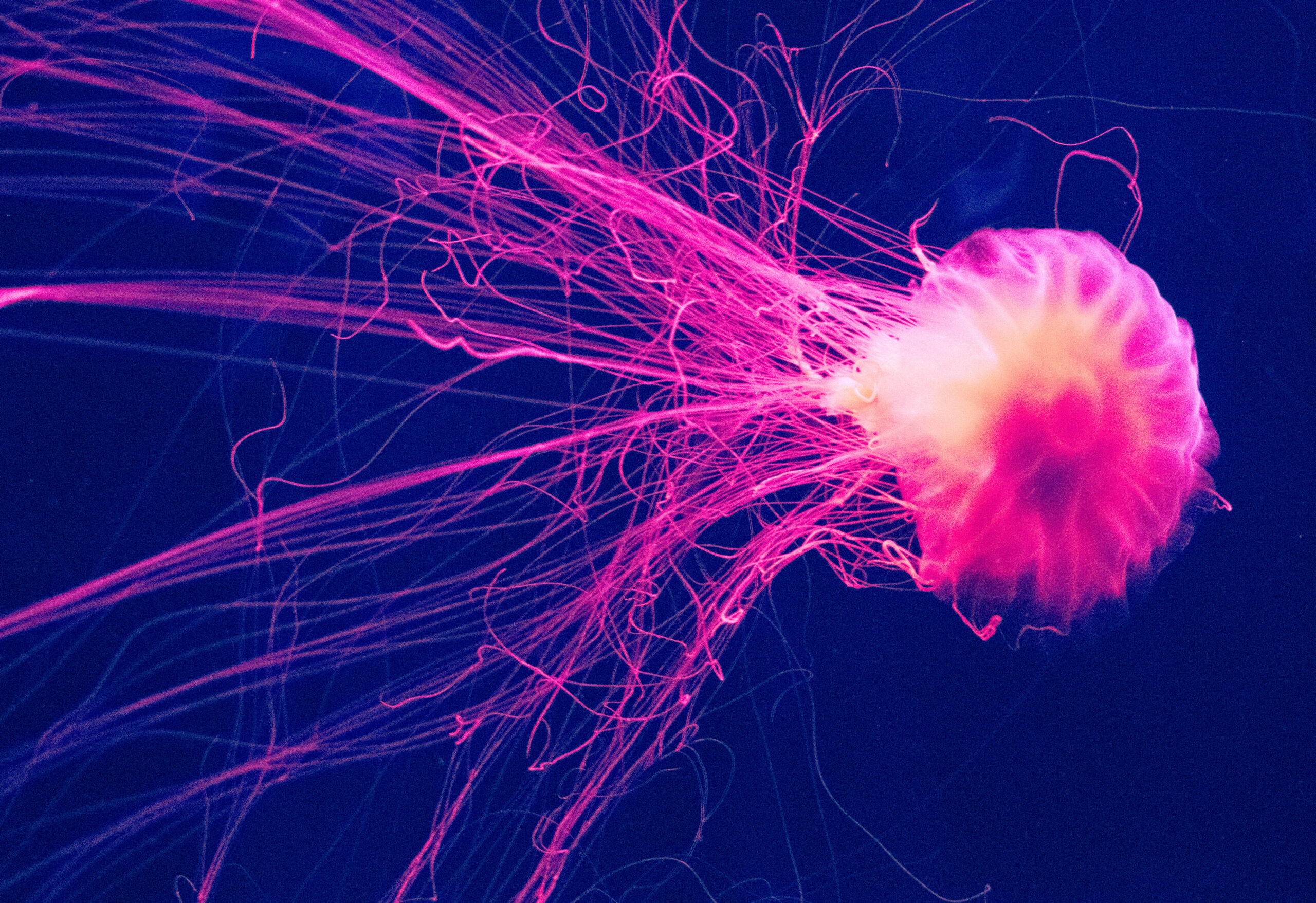
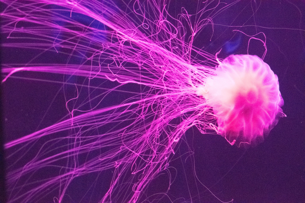
One of my favorites was this little guy
ISO 25600 f/5 1/40 sec
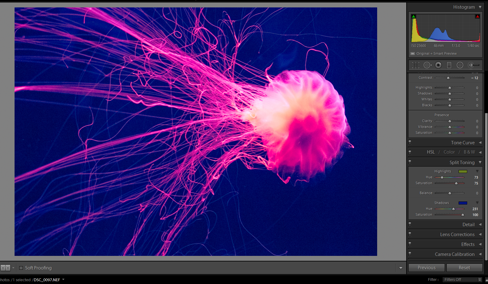
Great light, movement, and color. And I love an abstract. So for the color project I decided to just make it a little more dramatic, with the few tools I know. I imported it into Lightroom and cropped it a bit to take out the dark edge on the left side. Then into the Develop Module to do some split toning. I adjusted my histogram and checked to make sure I had some bright whites and dark blues (in this case, no blacks.)
I chose a blue hue for the shadows to darken them and reduce the appearance of noise in the background (not the best technique, but it worked!) and make the image more dramatic. I chose a yellowish green for the highlights to make the brighter spots pop.
And that is that.
Not a huge challenge, but a start. And that’s all I need, to put one metaphorical foot in front of the other.
What do you think? What would you have done differently? Teach me!



Comments are closed.