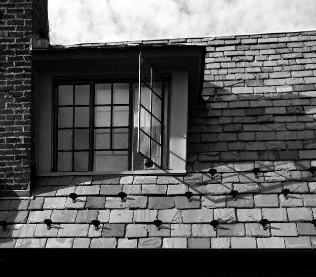
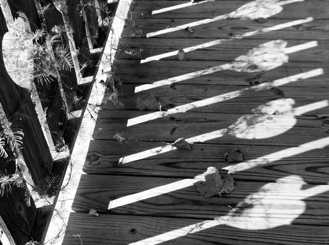
Hey folks! I like these creative subjects Chelsea is picking for the live show these days. This week the subject is “shadows.” Not just incidental ones that you get when you photograph a subject on a clear day, but shadows that you capture as an element of the composition. I’ve certainly shot images like that in the past, as seen here:
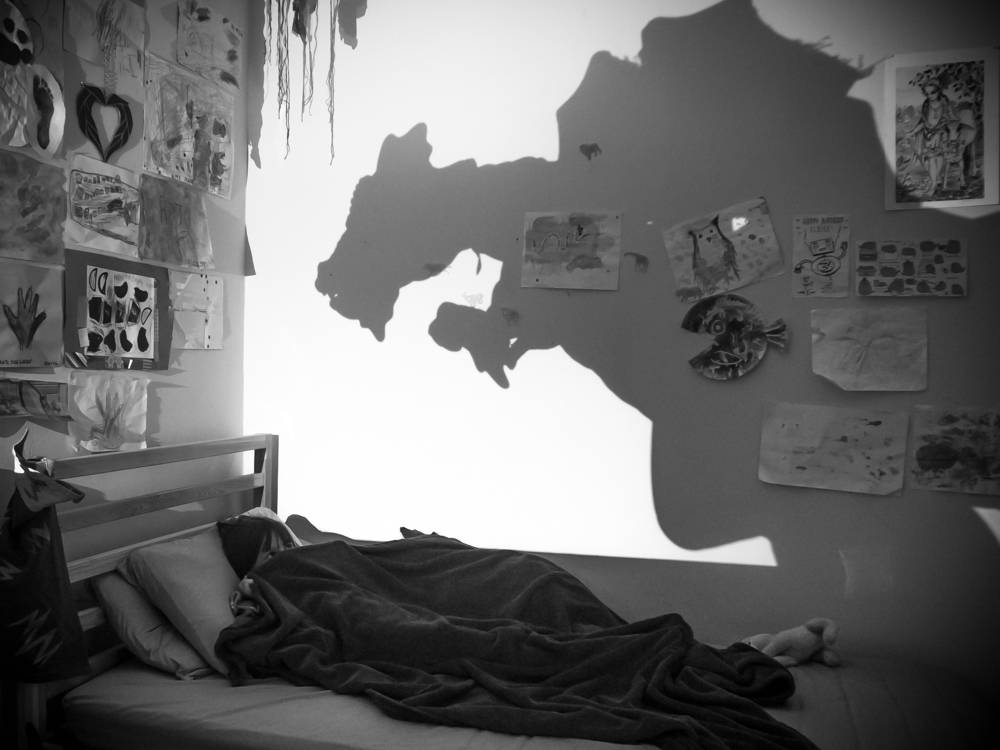
But this week I was inspired to create a shadow as an element of a story. I had the idea to photograph my daughter, Eloise, cowering under the covers with the shadow of a monster on the wall above her. So here’s how I went about it:
First, I set up my camera (an Olympus OM-D E-M10) on a tripod in her room. I then picked through Eloise’s vast array of stuffed animals, dragon and dinosaur figurines to find a properly intimidating shape. I placed it on her dresser, across the room from her bed, and propped my phone up behind it with the flashlight app turned on. It took some maneuvering, but I finally got the proper shadow size and placement on the wall.
For the camera settings, I had it in aperture priority mode, set to the lowest aperture, which was f/4.5. The shutter speed wound up being 1/4 of a second and the ISO at 1600, so it certainly isn’t the cleanest or sharpest picture, but the mood was more important. I went back and forth with it, but still stuck to Tony and Chelsea’s top tip and used a full white point.
I didn’t want the light from the flashlight to be too blown out and obvious, but the image was far too dark without it. I hope I was successful it making it look like night while still illuminating the subject.
Then came the post-processing. I use Adobe Lightroom for most of my editing (you can see some of our free videos from the Lightroom book here.) I converted the shot to black and white, as my daughter’s room is cluttered and brightly colored. I cropped and straightened the image, although it still feels a bit weird since I was shooting at an angle from the bed. I added some vignetting to make the room appear darker (it was shot at night, but the flashlight obviously cast a lot of light into the room) and dodged her face a bit so you could see she was there. I added some noise reduction and kept adjusting the exposure until I got what I thought looked best.
So, there’s my process, and here’s my final image:
So what do you think? Was it successful? I hope I conveyed the universal feeling of fear of the dark that kids experience. What would you have done differently? Let me know in the comments below if you have suggestions. I look forward to seeing all your submissions for the show this week!






Comments are closed.