Phew. Guys, landscapes. I can tell you right now that this is not my bag, for a number of reasons. 1) I live in Philadelphia. There are very few landscapes that won’t include people, cars, or trash. 2) I find landscapes boring (not yours! Yours are great) and 3) my camera phone is not made for them. All that to say, this week feels like an epic failure.
To make compelling landscapes you should have most of these things: large depth of field, interesting foreground or background, a focal point, interesting light, and leading lines. Since I have no control of my camera settings with my phone, I couldn’t control my depth of field or shutter speed, so all I could really do was with my composition.
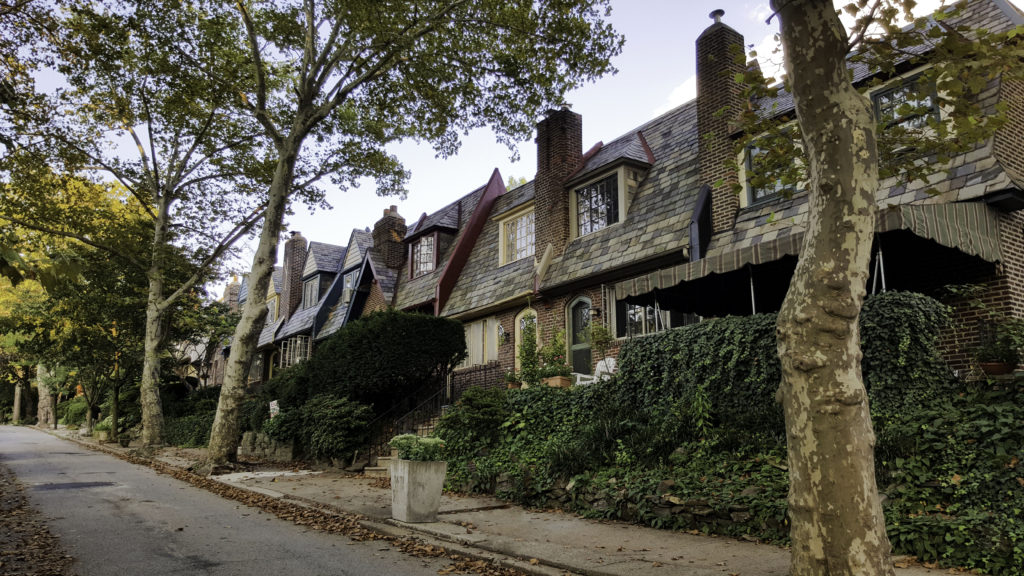
I walked my dog, Hungry, earlier in the week and got a decent shot of my favorite block in the city.
Nice light and colors during sunset, leading lines.
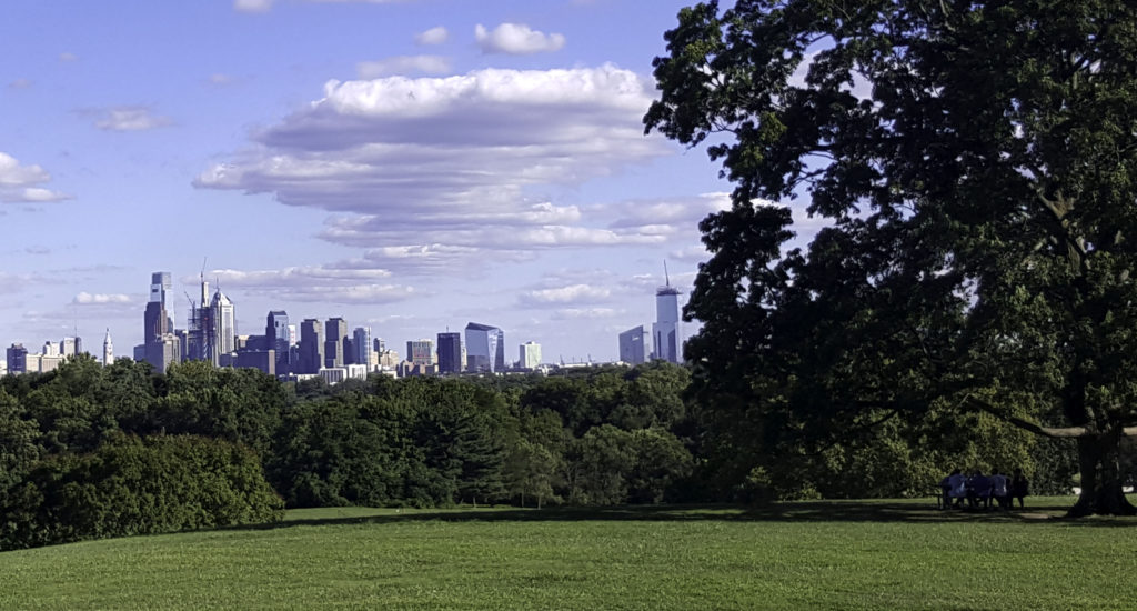
A few days later I got my family to come out with me to Belmont Plateau, where you can see the city skyline. Turns out my camera phone doesn’t do too well with distance. Or detail.
This is indeed a cityscape, but man is it boring.
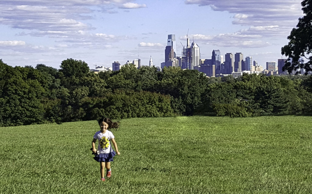
I tried to add a bit more interest by capturing my running daughter in the foreground.
I would have been better off waiting for sunset so I could have gotten some better light and more interesting color to the photos. As they are they seem very flat and boring. Next time I think I’ll go shoot some abandoned buildings. This city has a lot of character which just isn’t captured from a distance.
I attempted to stack a bunch of the images using Tony’s method in this video, but even that couldn’t seem to pull enough data from my wimpy camera phone to make any difference.
Do yourselves a favor and learn from Tony and Chelsea here.
And please, PLEASE tell me what I could have done to make these images interesting!


Comments are closed.