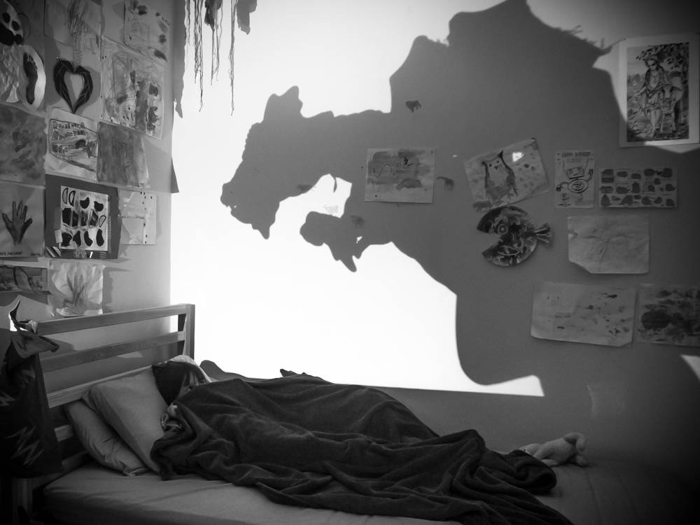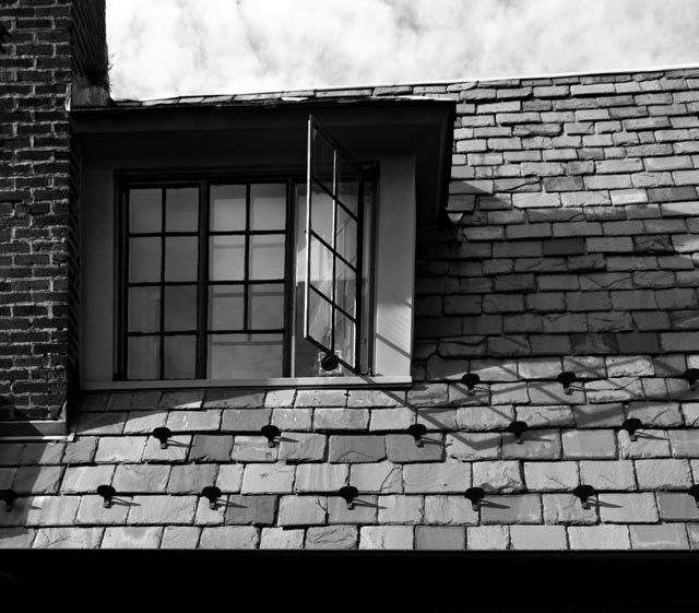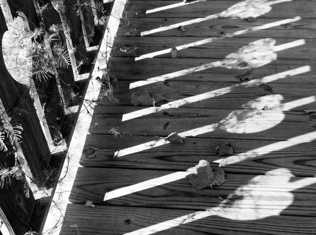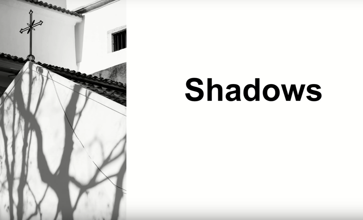
Hey there! This week was a fun one, I love more abstract concepts like this one. This week the subject was shadows (you can see my blog on the subject here.) We got some great submissions. Next week we’re doing natural framing, which I love!
AHHHHH the first 4 episodes of our new travel show, Wanderlust, are out now! Only the first episode is listed, but there are links below each video with the link for the next episode, shhhh.
In two weeks we’ll have the very talented fashion photographer Roxy Rodriguez on the show!
Ok, so we start the show, inexplicably, by going over to me with a single question:
- plans on going south for the solar eclipse? Nope!
Ok, let’s look at your photos:
- film set
- traffic light frame
- stunning staircase
- “if the shadows were doing something deliberate like-” “murdering.”
- stakes
- New Orleans
- head crop
Now for some photo news:
- CrystalSky drone monitor
- Dell’s new tablet looks cool
- Sarmonic mics use one receiver for two transmitters
- 25% off our t-shirts at sdp.io/tshirt
Now some chit-chat! The part of the show where you say things and we make fun of you maybe:
- how to turn on notifications for YouTube channels? Click the little bell next to the Subscribe button and choose “turn on notifications”
- tips on how to be chill like Tony? Have a cool hobby, be Tony.
- Captain and Tennille of photography? “Are his eyes real or is he one of those cave cats?”
- millennial hate is booooooring
- who is choosing our thumbnails? No one! They’re arbitrary. “Yeah, we’re not great at YouTube stuff.” “I don’t know how we got here.”
More questions?
- any tips on lighting senior citizens? Don’t underestimate people’s vanity. Side-lighting is a no-go. Use a big softbox on axis with the camera if you’re looking to eliminate wrinkles.
Now let’s look at a portfolio! Hey Matthias, that’s a weird way to sign off. Lovely shots. Kinda weird layout, but great having the images full-screen. Pare down some images, combine the categories, simplify.
Over to me for a few more questions:
- wanna visit Dubai? Yes.
- any tips for shooting a wedding on top of a mountain? Pack light, dress accordingly, bring oil blotter sheets. Use Google Earth to figure out the lighting and landscape to plan ahead. Watch your alcohol intake in high altitudes!
- how do you see the future of photography due to people learning online? Chelsea says better work due to more people being educated and exposed to it. Trends come and go quicker, they make people have to be more experimental. The format is a good challenge.
Back to your photos!
- two of a kind
- motorcycle selfie
- mirror image
- ski lift (Kyle Medina!)
- parkour
- oh heyyy I got a pick! “Girls are so smart.”
- three men accidental composition
- “they make these goofy dummies look like big dangerous animals“
- rude dudes
- how to overcome photo pricing low-balling? Call um cheap. Let them go with the better deal, you can’t convince someone of your value. Some projects are worth parsing out with them though, you can’t cheap out on a wedding.
Back to your photos:
- “walloskulls”
- “Bodie is for bitchessss”
- cemetery sign
- gull shadow
- spooky
- colored pencils
- “hey, there’s also a tree behind you”
- giant piano
- shadow shapes
- lines
- spiral staircase
A few last questions:
- wildlife body? D500 for flying birds, but the 5DSR is the home set-up for backyard perched birds.
- how to get shots of running dogs and get the eye in focus? Your focusing points make all the difference.
- rumored RGBW sensors in future cameras? Yes! Very technical explanation to follow.
Speeding through shots at the end of the show, here are some standouts.
And that’s our show! Check out Wanderlust at sdp.io/WL1 and join us next week for “natural framing.” Thanks guys!

