
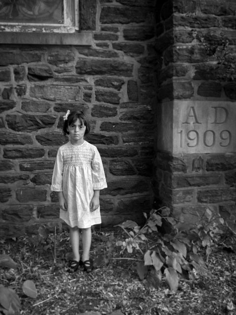
Guys! This was a fun one. I paid my daughter, Eloise, in candy to come out with me and take some photos, because kids are creepy as heck. Styling, setting, and mood are very important for setting a spooky scene. I put her in a vintage dress and hair bow and put brown eye shadow around her eyes and on her cheek bones to make her look emaciated. I also put cover-up on her lips to make her look paler. She wound up looking quite ghostly.
I had a place in mind to shoot, a condemned church in our neighborhood that would fit the old-timey vibe of her costume. We went out around sunset so that it would be a bit darker out to suit the mood. I would have shot later, but I don’t have an external flash and my camera isn’t the best in low light situations. You’ll see that the images came out pretty noisy, luckily it didn’t much matter with the mood of the images.
The one thing I regret is not putting her in different shoes. The shoes she wore are really modern and I had intended on having her take them off, but then didn’t want her standing in sticks with her bare feet. The styling is so important though! Something modern looking in a photo that is meant to look antique will take the viewer out of it. Pay attention to detail! Eloise is not great at smiling for the camera, so she was kind of perfect for this shoot. There are so many old buildings in the area that served for great settings. Here’s what I came up with:
I positioned her with the date of the building to add context. I also used a radial filter to blur the area around her for mood. I converted all the images to black and white and pulled down the reds and oranges to lighten her skin. The dress wound up far brighter than the rest of the scene, so I pulled down the highlights.
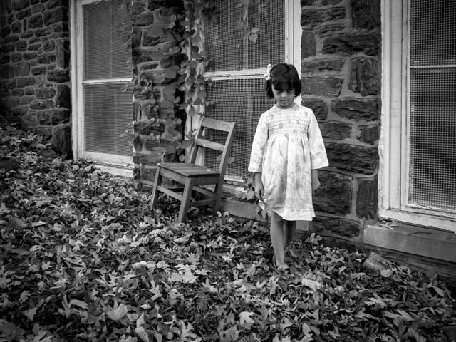
I loved the little chair sitting by the building, along with the slope of the ground. I positioned Eloise coming towards the camera and nearest the right of the frame to have her uncomfortably entering the viewers space.
I wanted a shot of her in front of the Danger sign, although it messes up the timelessness of the scene a bit, the signs are obviously current. But look at that vacant stare!
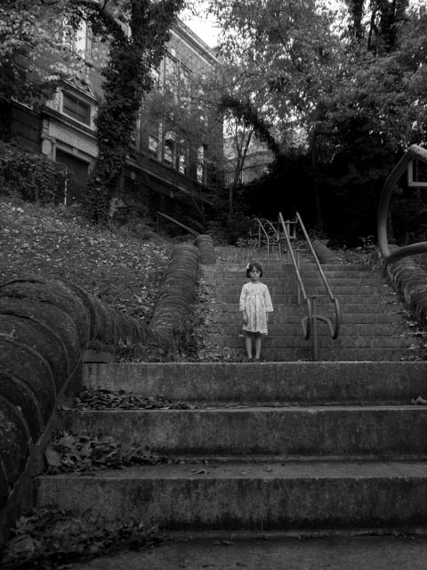
This is probably my favorite. The leading lines up to her, the darkness in the trees behind and her creepy stance.
How’d I do? Did I successfully creep you out?




Comments are closed.